UX Designer, Cribly
Work from Feb 2020 - Sept 2021
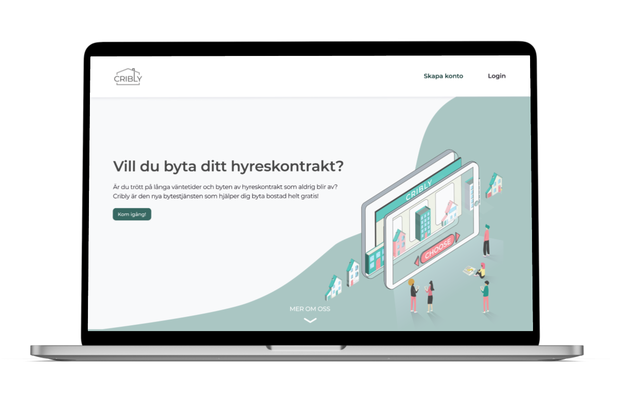
Cribly is a Stockholm-based startup aiming to mobilize the rental housing market in Sweden since 2019. With their matching algorithm, they automate the process of swapping first-hand contracts for rental apartments.
My initial focus when joining the team involved leading user research initiatives to gather a deeper understanding of the swapping process and identify pain points among the target group. Using the insights from the research findings, I delivered feature specifications and presented innovative ideas for the MVP website. I worked on selected UI projects, brand guidelines, and testing, collaborating with a cross-functional team, including a product manager, two UX Designers, and three engineers. Additionally, I actively engaged in feedback sessions and knowledge sharing to foster continuous improvement within the UX Design team.
Responsibilities
✏️ UX/UI, User Research
Role
🎨 UX Designer
👥 Worked closely with two UX Designers, Business developer, and Front- end developers
Timeline
⌛️ 1,5 year
Design Process

User interviews & Surveys!
User research was an iterative process throughout the project, starting with talking to tenants who had tried to swap their apartments. Other tools such as competitor analysis, surveys, and in-depth qualitative user interviews were also conducted to identify key issues tenants encountered during the swapping process.
Research Goals
With the knowledge of Design Thinking, I conducted nine in-depth interviews with tenants who had tried to swap their apartments. The research was used to validate design decisions during the rest of the project.
- Tenants experience with the search process of finding an apartment to swap with
- Their general reason for swapping, how long it had taken, and what platforms they used
- What their experience was regarding the information available about the apartments
- Their experiences having contact with people they matched with
- Their feelings and experience regarding apartment viewings and how it could have been made easier
The questions were based on findings from previous market research. The purpose was to dive into these problem areas for a deeper understanding of the tenants' thoughts, experiences, and feelings regarding different steps of the swapping process.
Key Insights
Insight #1
Time-consuming and tedious process
In general, it was a very tedious process and it needed to be an incentive for the swap to occur. Almost everyone expressed negative feelings regarding their experience of searching for apartments as it was time-consuming but also expensive. All interviewed participants lived in rental apartments due to economic reasons, and their reasons for swapping varied from the need for lower rent to changes in size or location.
Insight #2
Used multiple platforms
Throughout the swapping process, multiple platforms were usually used, but also Facebook groups for swapping and Blocket.The main platform Lägenhetsbyte.se, had been used by almost all participants.
Insight #3
Unreliable users and lack of trust
Dissatisfaction was especially shown towards the platform Lägenhetsbyte.se, as it was expensive, especially for those who were required to use the platform for several months. The impression was that the platform did not give a result, as well as irrelevant or deleted matches. A frequently occurring problem was people who did not reply or stopped answering after a conversation was initiated which increased the feeling of unreliable users.
Insight #4
Listing information varied
A lack of structure and insufficient information was a common problem. Some had a detailed description while others were more limited. An occurring problem was inaccuracies regarding the information to enhance the attractiveness of the apartment. A majority stated that including personal information in their descriptions, increased credibility. As some said lack of trust is a reason for not feeling comfortable doing so.
Insight #3
Apartment viewings
Feelings about viewings varied; some found them enjoyable, while others felt uncomfortable or intimidated. It was also common that background checks were performed. A booking system was proposed but met with mixed opinions, and viewings for three-way swaps were challenging. Participants had a critical attitude towards group viewings, preferring personal contact and the ability to ask questions.
User persona
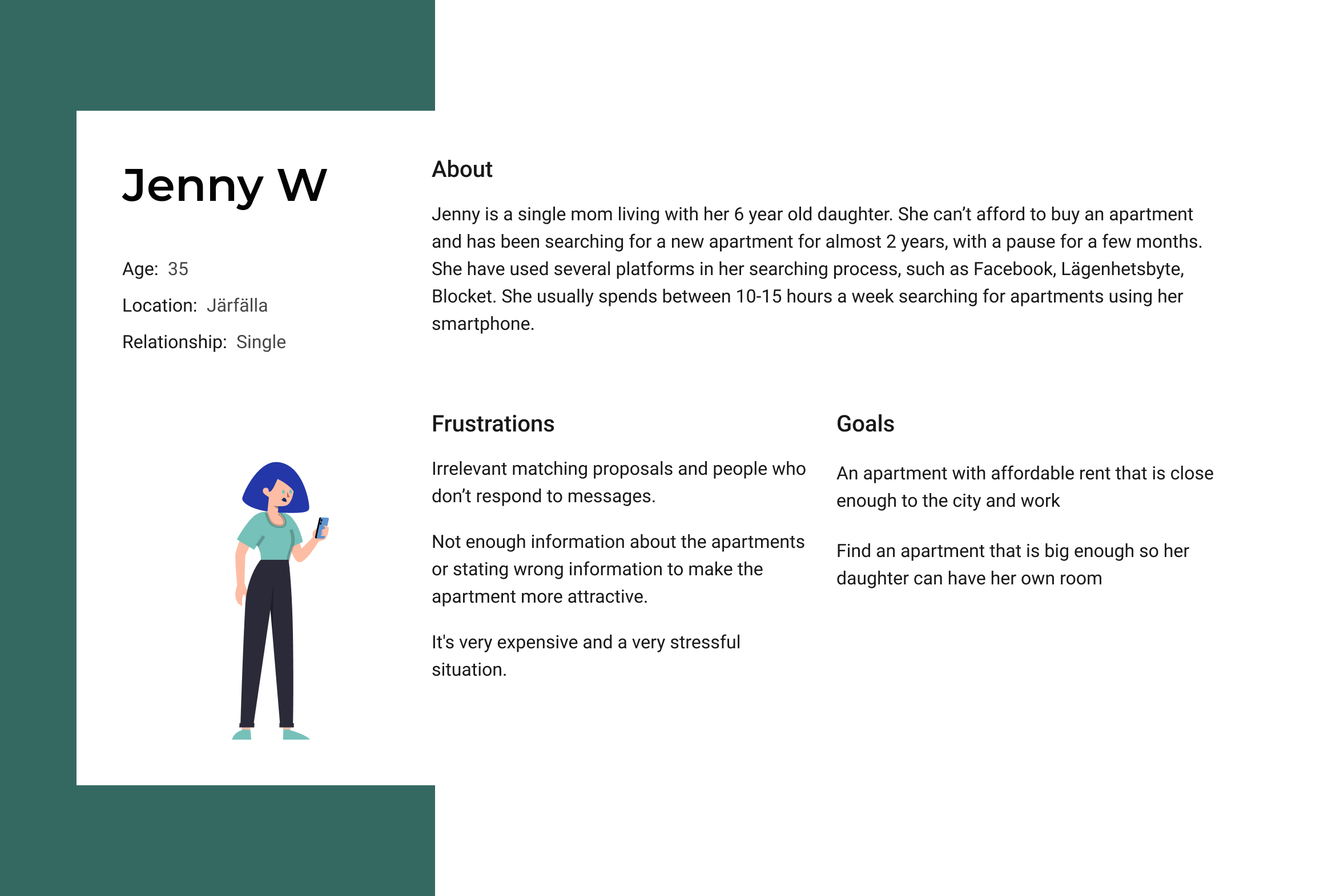
To communicate the users' needs and pain points personas were created which were used during the design process to empathize with users and make design decisions that better meet their needs.
Competitor analysis
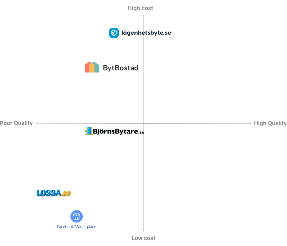
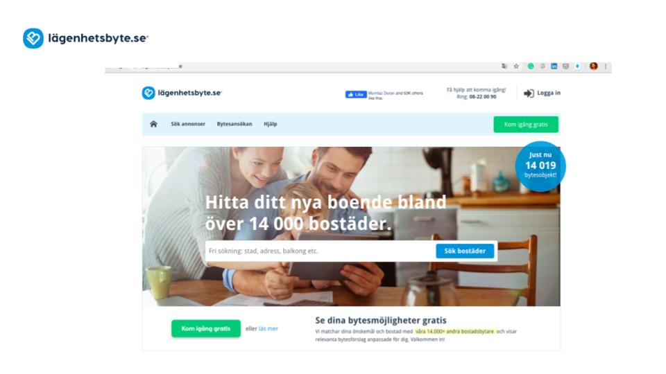
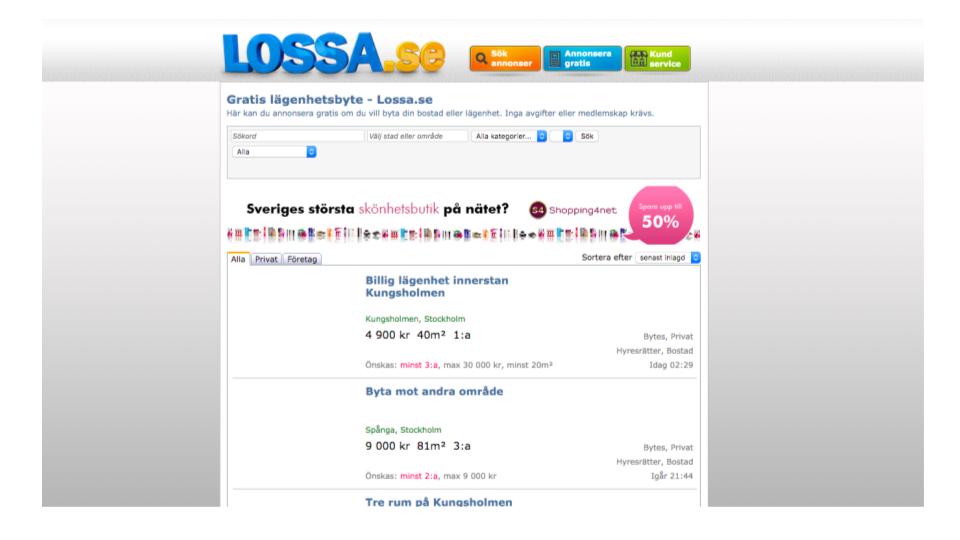
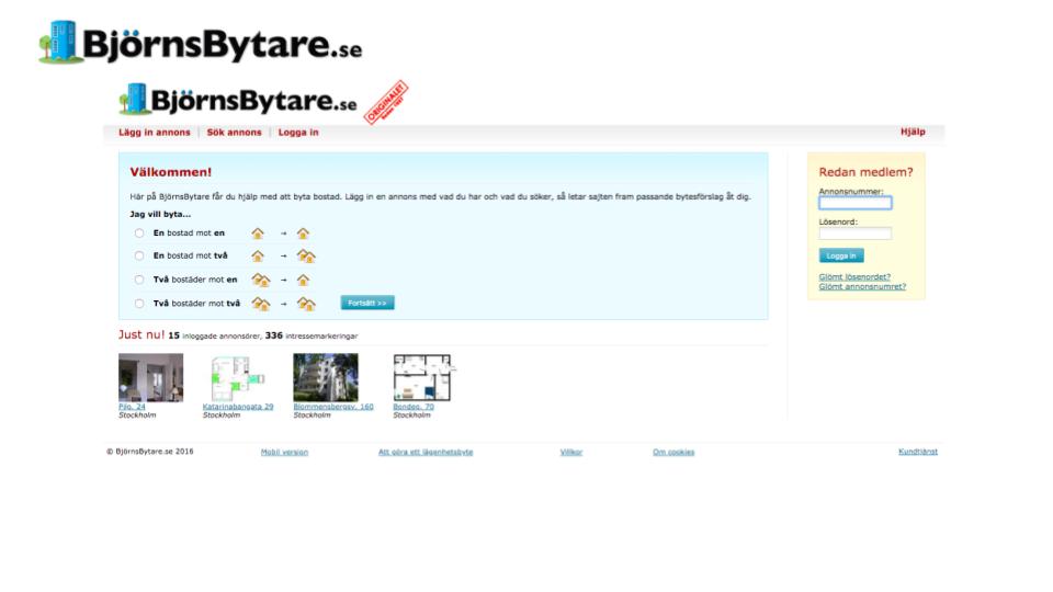
There was significant frustration towards the platform Lägenhetsbyte due to its high cost, lack of trustworthiness, and reliability. Some had managed to swap through Blocket and Facebook and said it felt more personal while others thought it was useless.
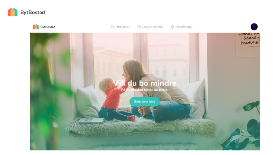
The creation of competitive profiles (in terms of marketing strategy, business opportunities, usability, layout, navigation structure, compatibility, content, design, and performance) together with SWOT analysis helped to assess current offers in this area.
LET'S BE CREATIVE
Design opportunities
Opportunity #1
Standardize listing information
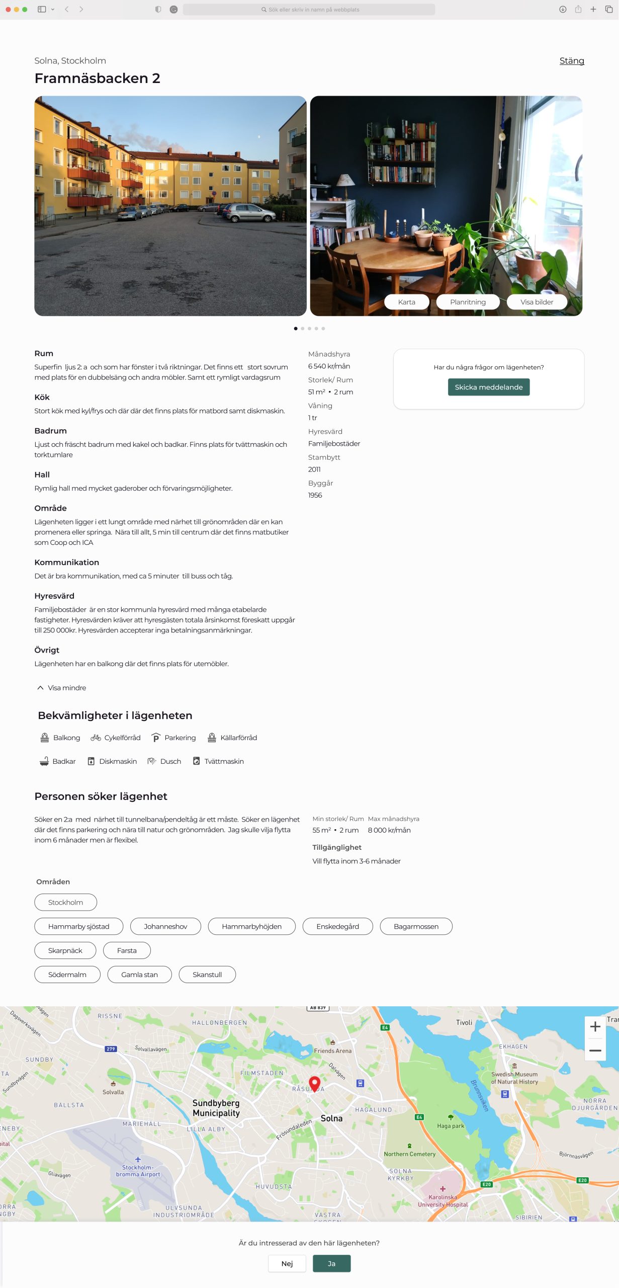
The listing page needs to be visualized intuitively with accessibility so information can be easily read. Creating coherence by dividing the description accordingly with each room and additional spaces. Visualizing the information in a standardized way will also be more convenient for the user regarding what information to include and reduce the risk of other users being required to request additional information about the apartment.
Opportunity #2
Verify users through BankID
Verification of users through, e.g., BankID could further increase trust, not only for the platform but to verify who they are especially for apartment viewings. Verification could further be used to ensure that the user meets the landlord’s requirements, especially regarding income.
Opportunity #3
Details what someone is seeking
Timeframe or other requirements could be visualized on the listing page to inform users what someone is seeking. Details and preferences need to be included at an early stage of the swapping process to increase the relevance of matched apartments. Further, with a sorting function and a filter option, searching apartments can be adjusted based on the user’s preferences.
Opportunity #4
A booking system for three-part swaps
Although a booking system can help users manage viewings, it is not necessarily an essential functionality to complete a swap. It is important to consider what creates the most value in comparison to available resources. However, a booking system would be valuable for a three-part swap as it would give transparency and provide an overview of the process between the included parties.
Opportunity #5
Digital viewings
A possible solution for approaching the feeling of awkwardness would be digital viewings as a first step to show the apartment and establish contact. The tenants would then more easily assess whether they want to go further with the apartment or not.
Defining the flow
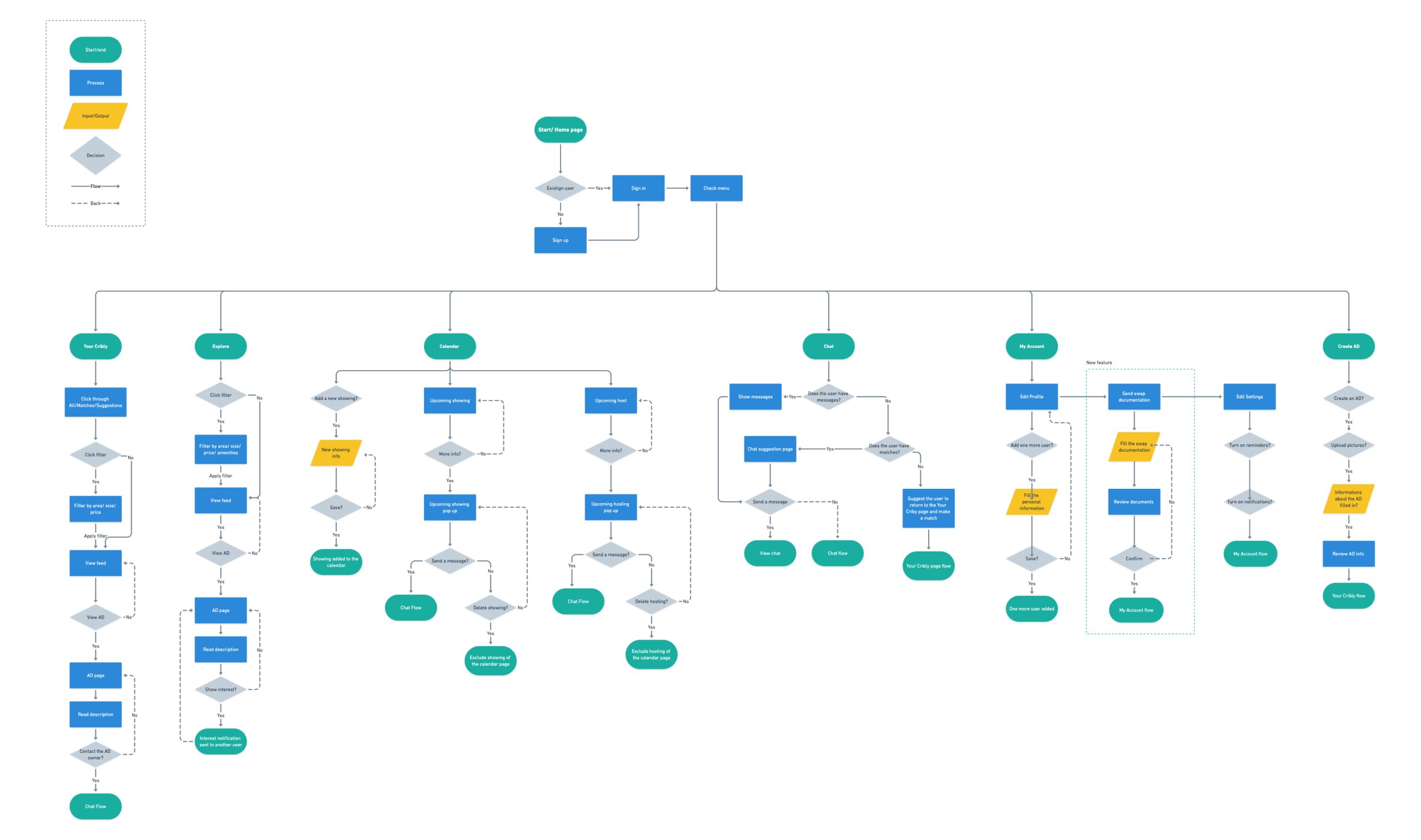
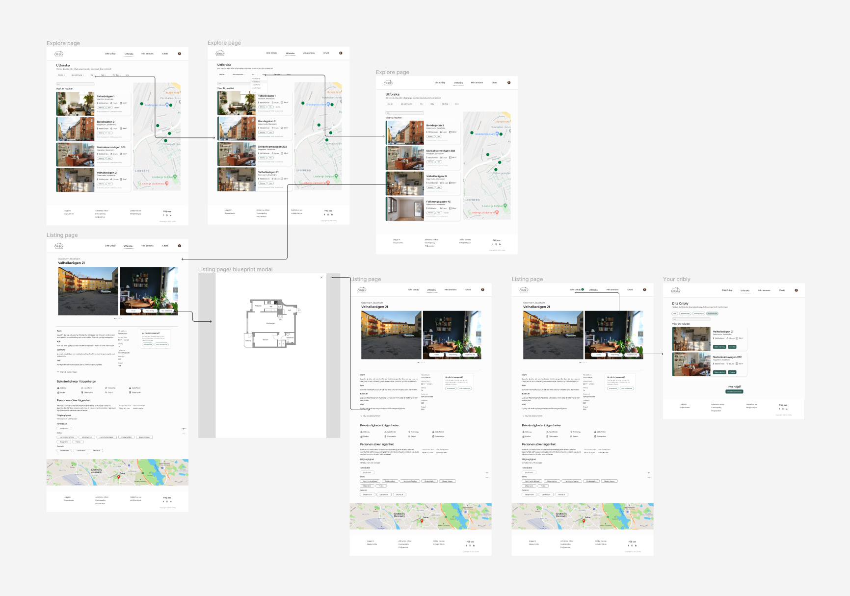
The sitemap was used to facilitate the visualization of the entire site and provide a general overview of how the platform would be organized. It also helped designers and developers communicate the flow, understand the navigation, and scope of work, and avoid missing important parts of the site's architecture. After defining the structure, the ideation process began by exploring different design solutions.
Wireframing & prototyping
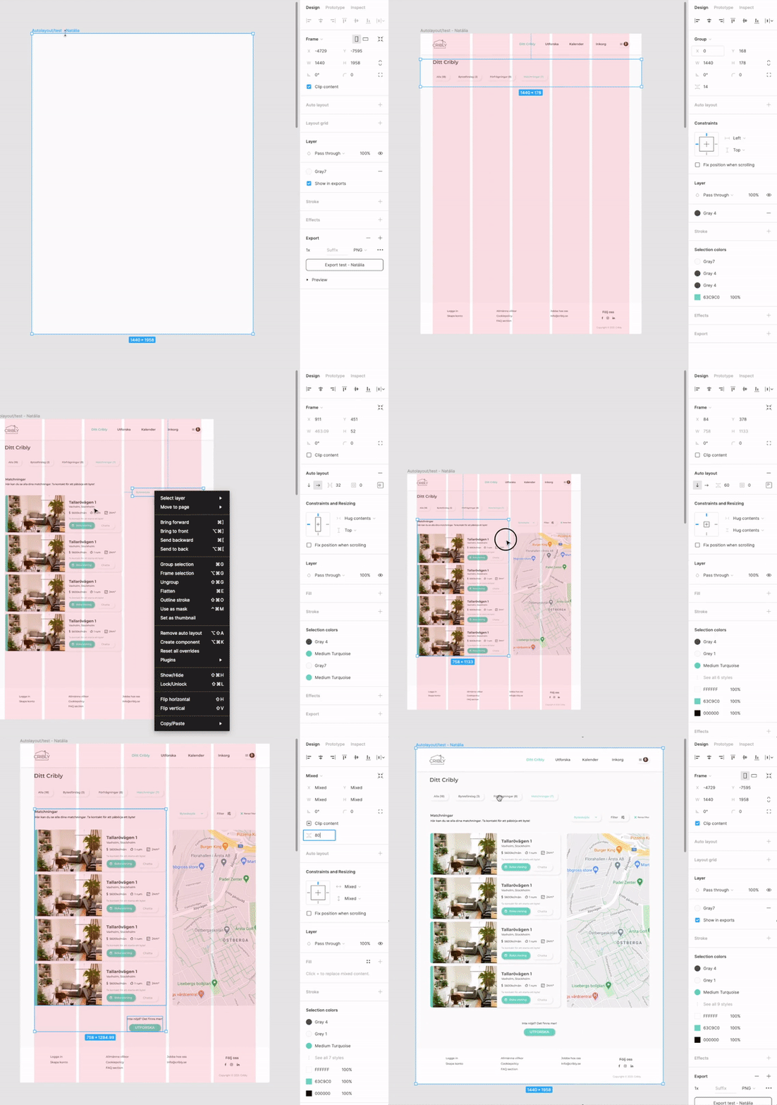
With the flow defined, several iterations of lo-fi prototyping were made to explore different approaches in more detail. After creating the wireframes on paper, they were converted into Figma. Once the prototypes were completed, the testing phase began and with these insights, a few more adjustments were made before arriving at the final UI design. I was responsible for the user research, design strategy, concepts, and execution for the listing page.
Paper-Prototypes
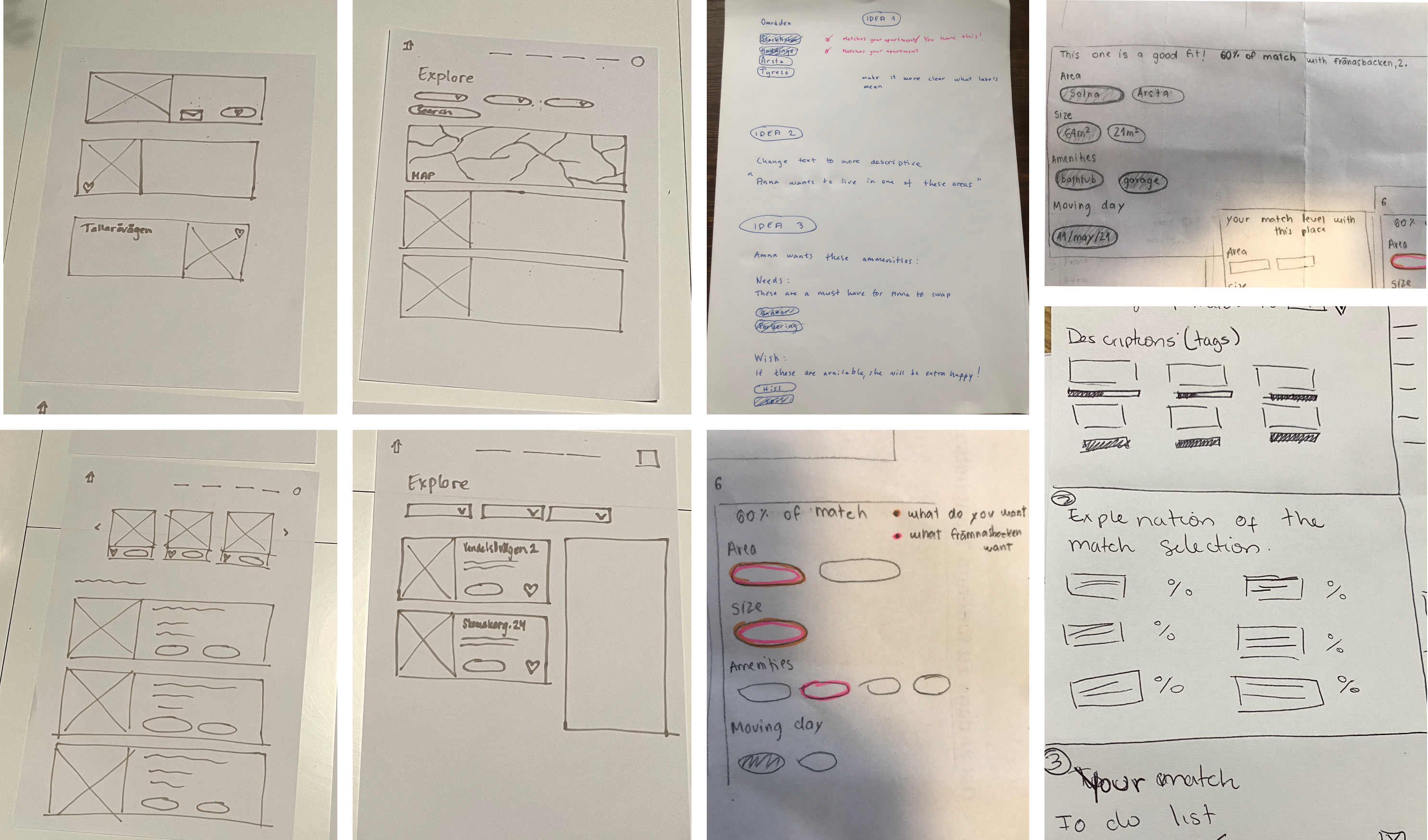
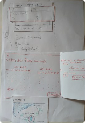
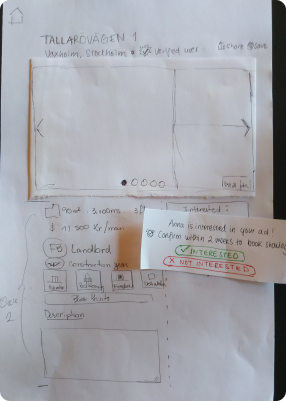
With low-fidelity paper prototypes, the planned syllabus and the general structure of the listing page could easily be tested. Without much effort, adjustments could be made before going into the much more costly digital implementation.
Clickable prototypes
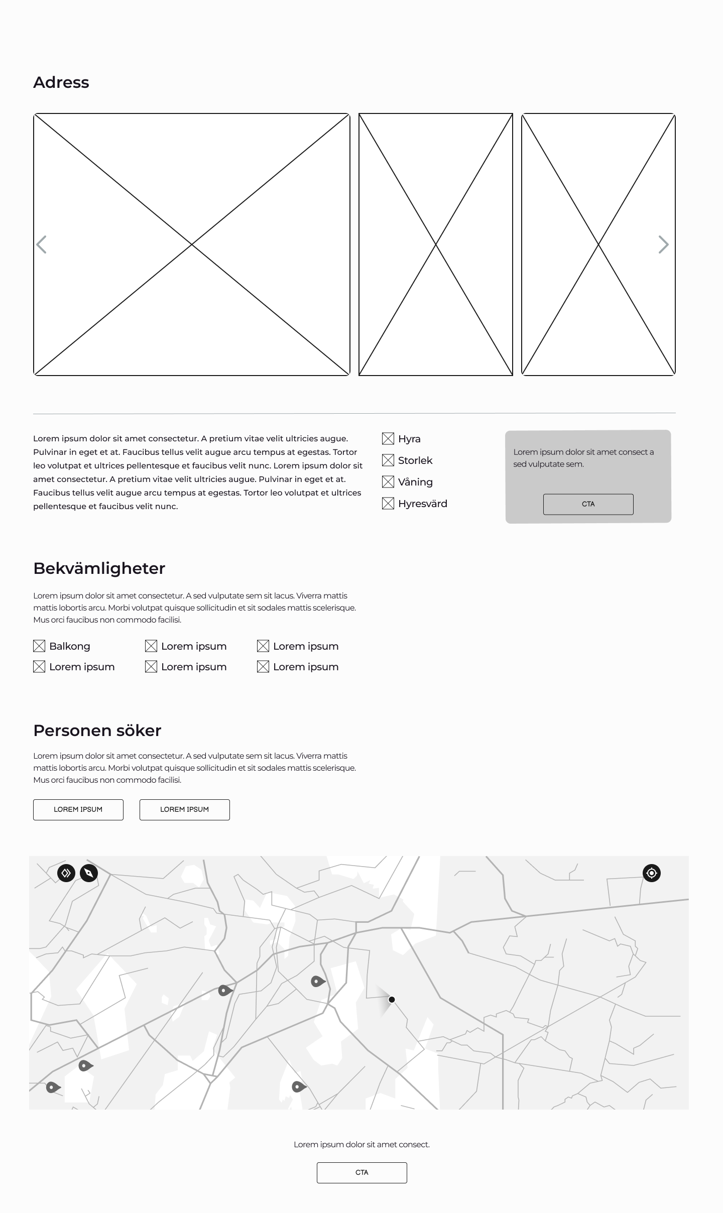
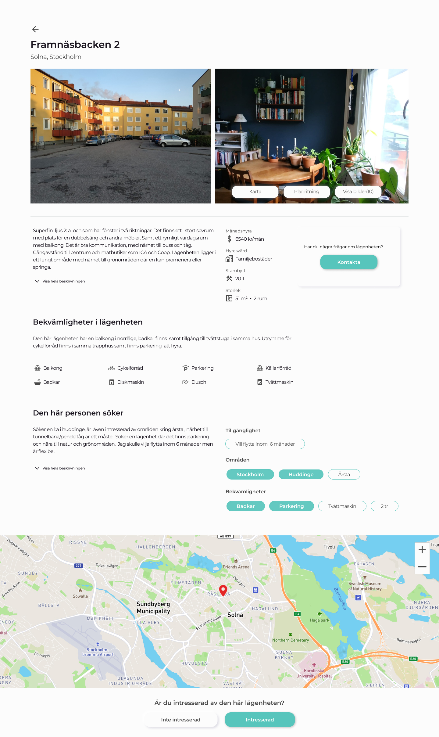
After some paper prototyping adjustments, wireframes, and mid- and high-fidelity prototypes were created, which I supplemented with clickability using Figma. User testing revealed small vulnerabilities in the structure of the user interface, in some formulations and interactions. With feedback from users led to further improvement.

Visual Design
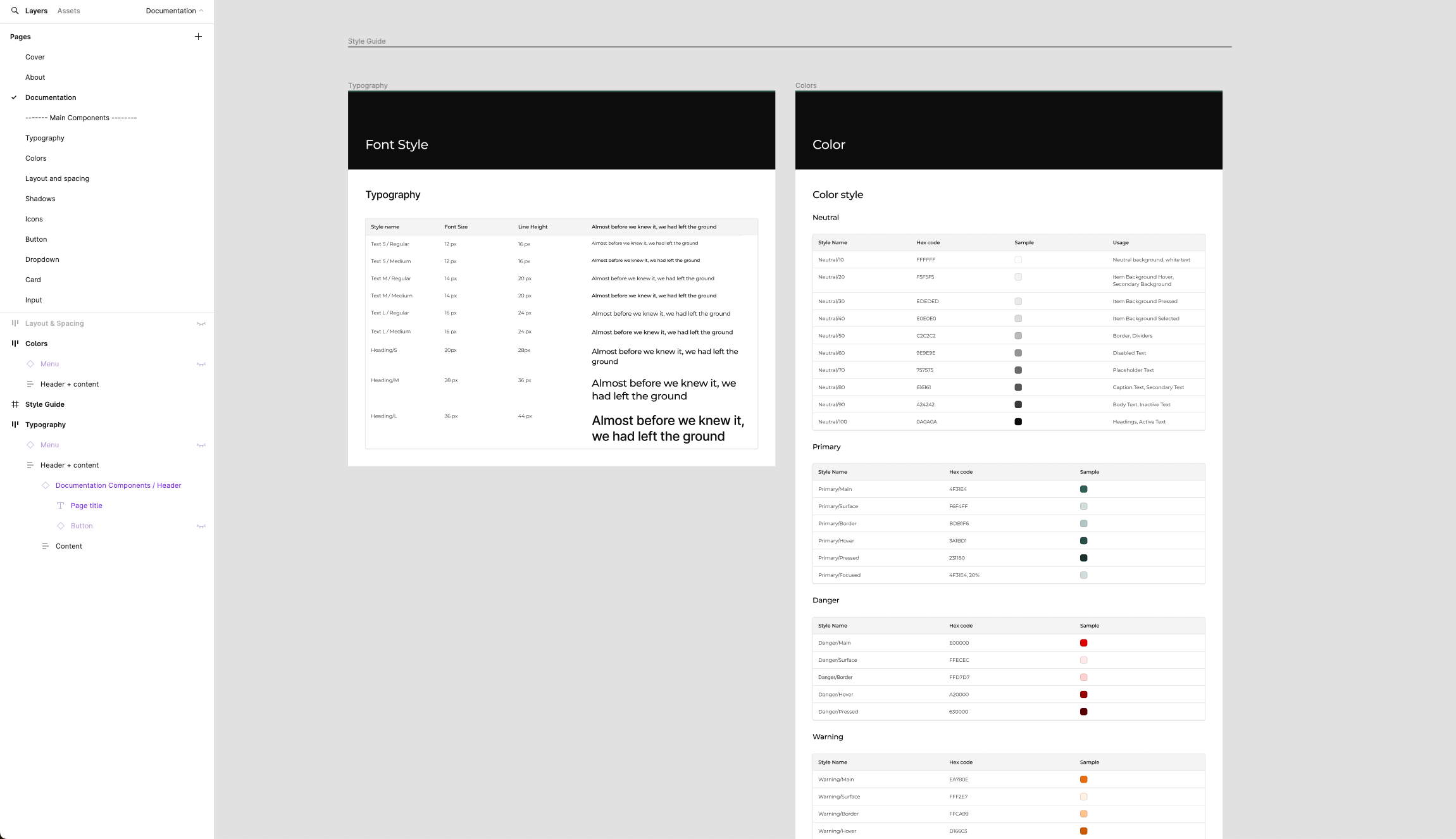
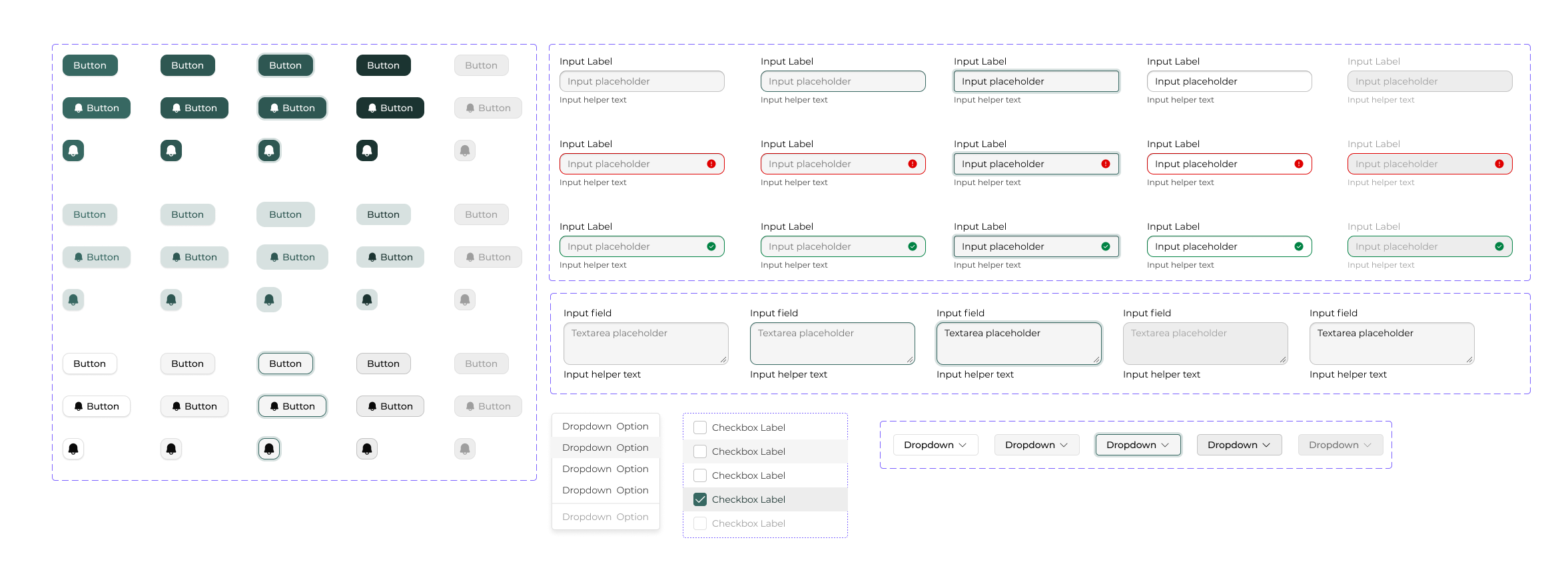
The visual design evolved through a process of iteration, starting with mood boards, style guides and progressing to the UI kit, and culminating in the creation of the initial version of the design system.
Final design
