UX Designer, wec360°
Work from Oct 2021 - Oct 2022
I joined wec360° in 2021 as their very first UX Designer and played a crucial role in shaping the user experience across the company's different products. I collaborated with the CEO, developers, and the sales team to execute long-term and short-term design initiatives with a user-centric approach. This experience gave me personal and professional growth, providing me with a wealth of knowledge and confidence in my design skills.
wec360° is a property marketing company specializing in providing solutions for visualizing properties in 3D. Through their digital presentation tool, they strive to deliver streamlined experiences and help clients sell properties more efficiently.
Type
🖥️ Website
✏️ Research, UX/UI
Role
🎨 UX Designer
👥 Worked closely with the CEO, a graphic designer, a developer and the sales team
Project Timeline
⌛️ 4 months
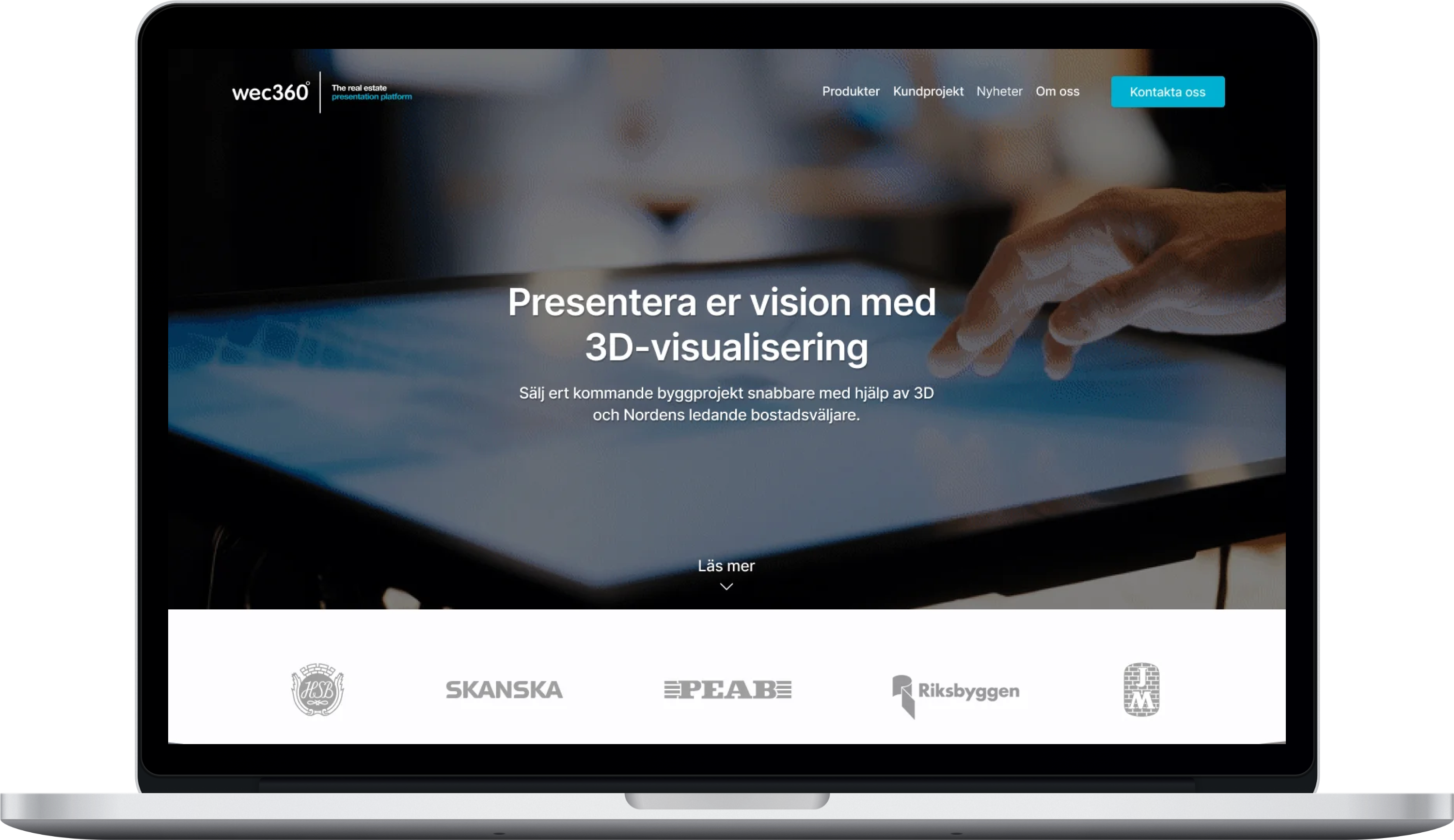
Website Redesign
I played a key role in conceptualizing and executing the redesign of the website. Since the company heavily relied on customer acquisition, the primary goal was to identify areas of improvement and elevate the overall user experience.
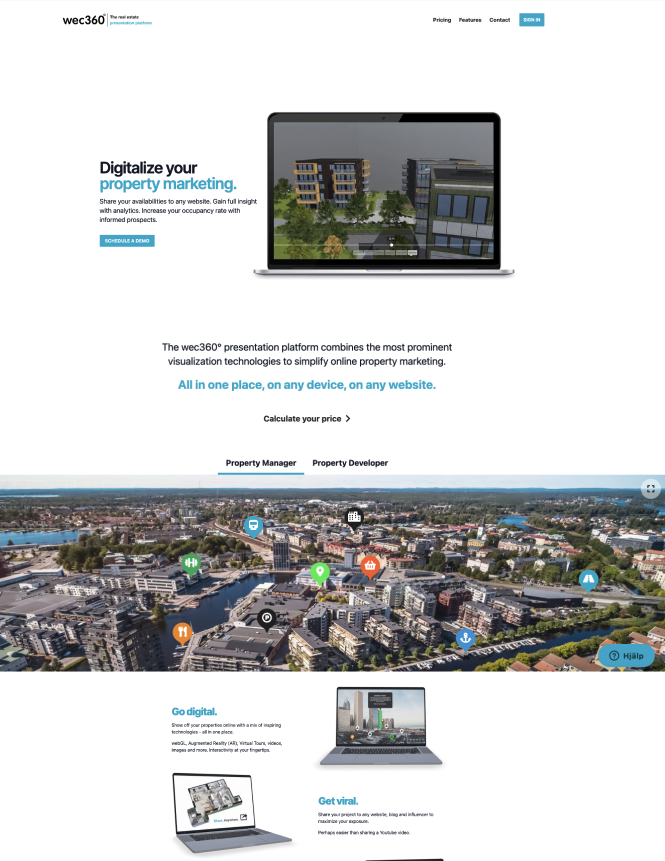
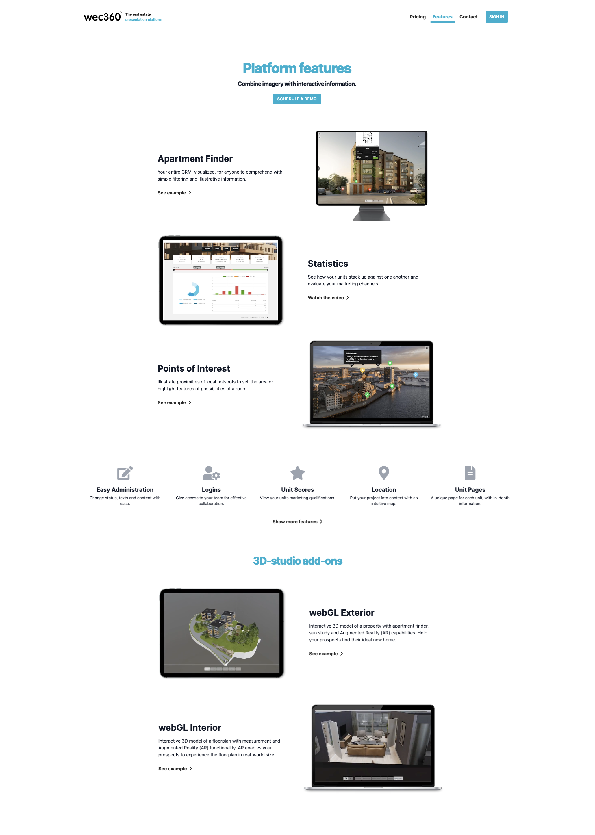
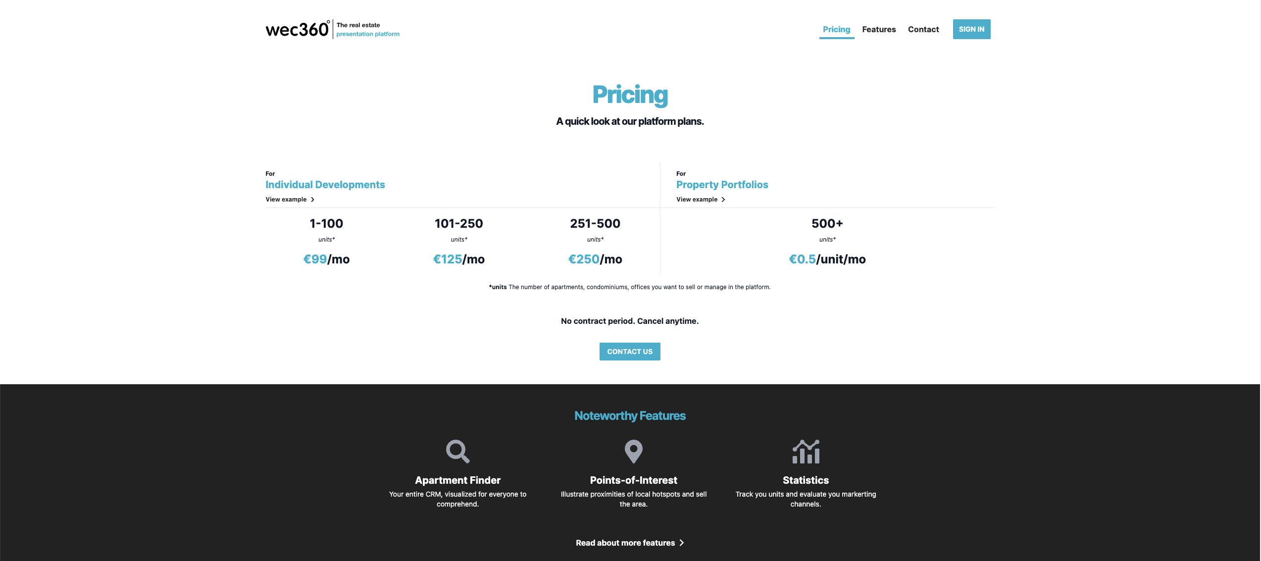
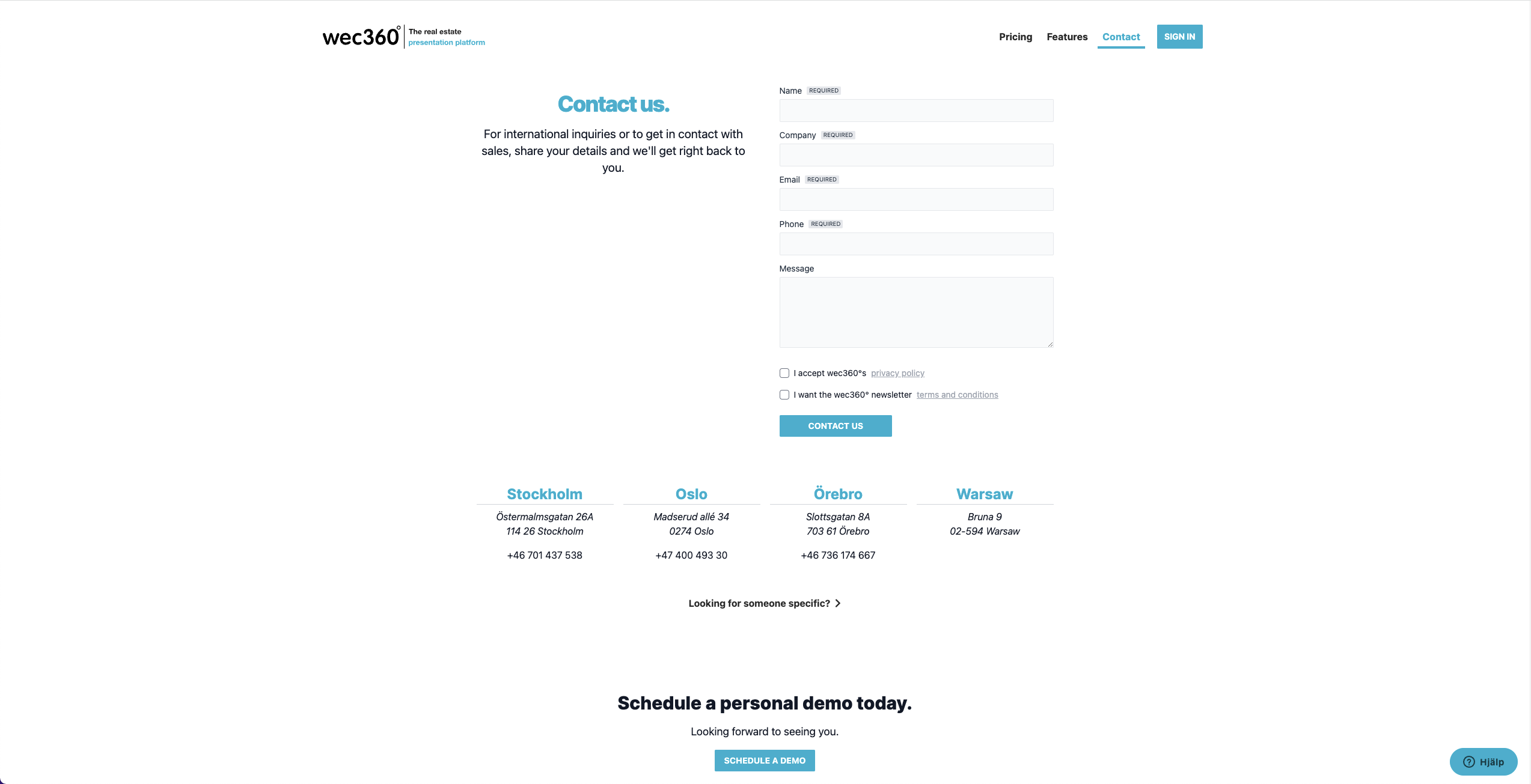
Website review & observations
- The website was in English despite the majority of the customer base originating from Sweden and Norway, leading to missed opportunities for customer engagement.
- Identified accessibility issues regarding readability and colors with low contrast ratios which failed to meet WCAG accessibility guidelines.
- The website's design element lacked consistency, with low-resolution images, uninspiring and incomplete product information, resulting in an unprofessional impression and low reliability.
- The website lacked responsiveness resulting in a disjointed and frustrating experience across devices where content appeared distorted or inaccessible, leading to usability issues.
- Call to action (CTA) buttons were poorly positioned, lacked clarity, and failed to stand out to make it challenging for users to understand what action to take next.
Competitive analysis
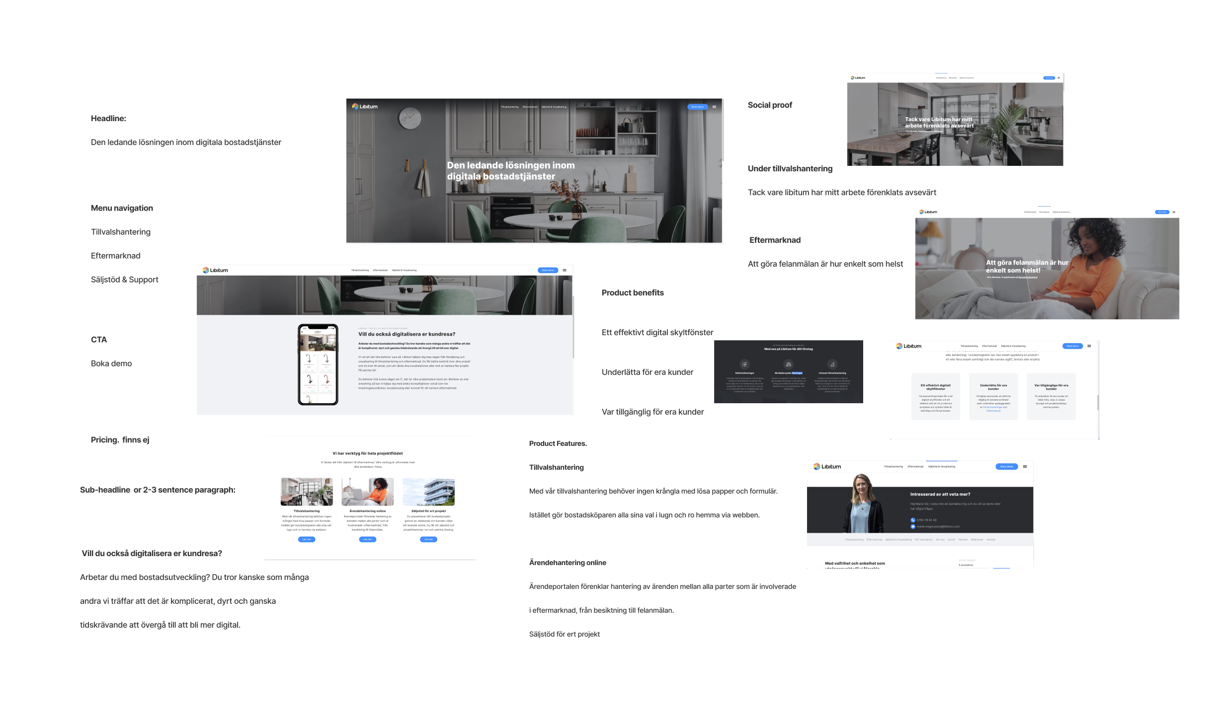
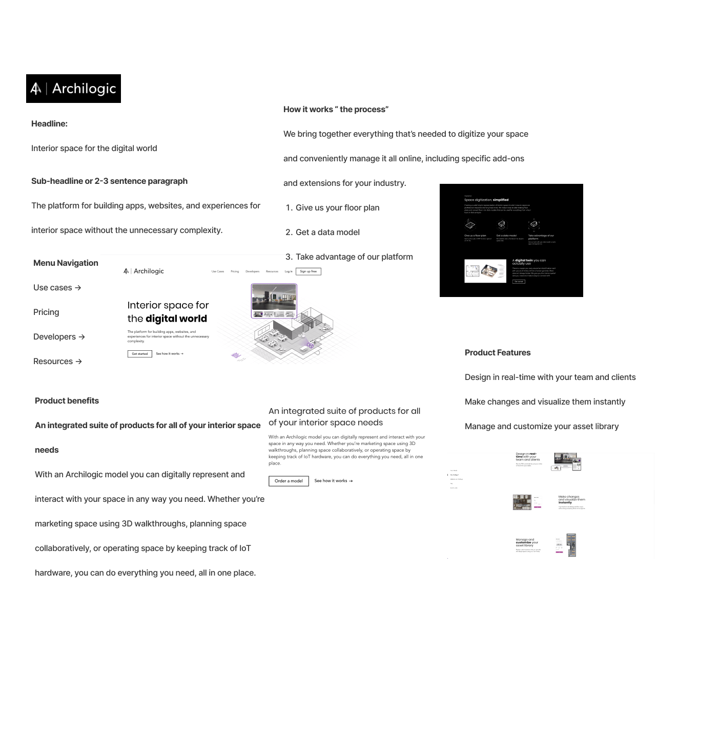
Before diving into any design work I conducted a competitor analysis to familiarize myself with existing competitors in the market. I examined various competitors and their overall user experience, focusing on design elements like navigation, layout, functionality, CTAs, and product information.
Concept creation
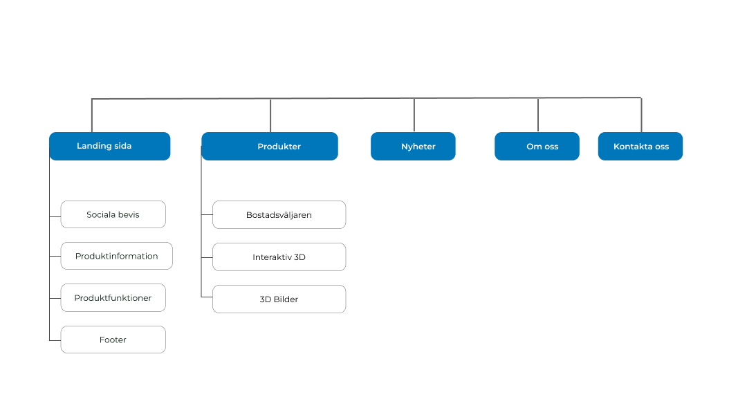
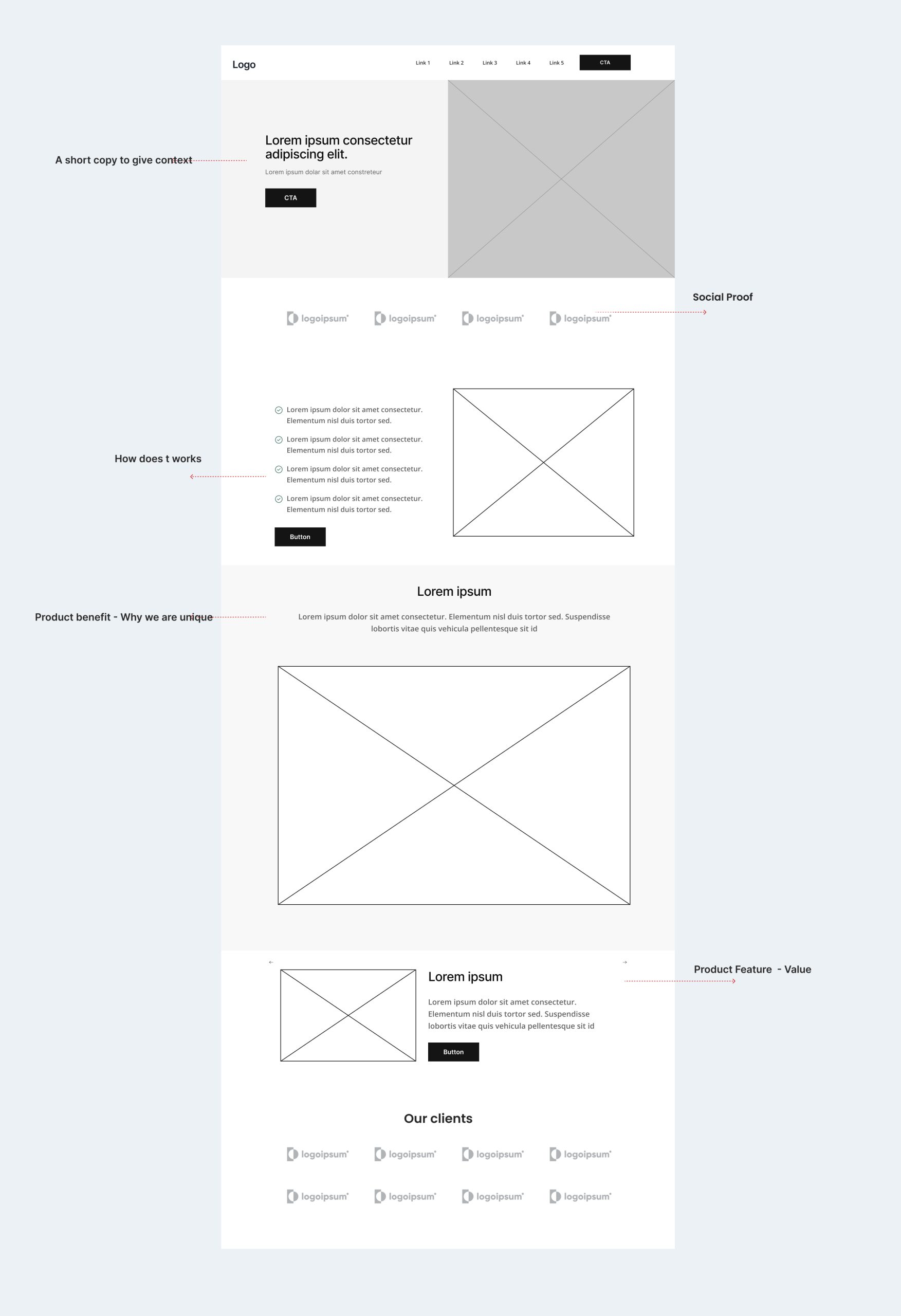
After reviewing the website I converted the made observations into requirements for the new website. Faced with time constraints I facilitated a collaborative brainstorming session with the CEO and the sales team. This session was crucial for aligning our objectives, specifying which products to highlight, and identifying our target audience for the website. Using insights from the brainstorming session I created a sitemap to visualize the website’s structure along with the first draft of the landing page.
Wireframes & prototyping
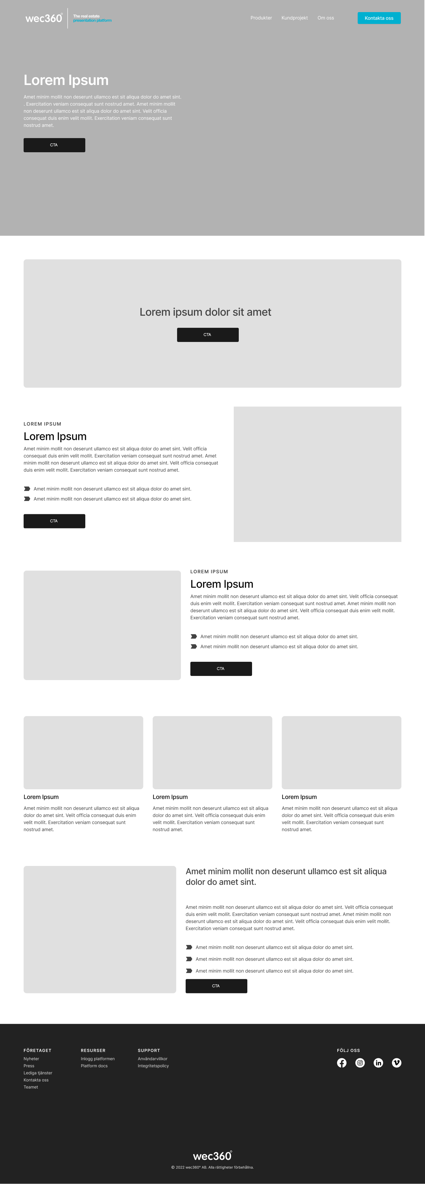
Workshops were held to explore new concepts, color schemes and fonts, to create a style guide for the website. Content-wise, the focus was on aligning on the company’s vision and showcasing its wide range of products. This entailed clear calls to action (CTAs), presenting product information focusing on 3D products and the apartment finder, showcasing successful case studies, and facilitating easy scheduling for meetings with the sales team.
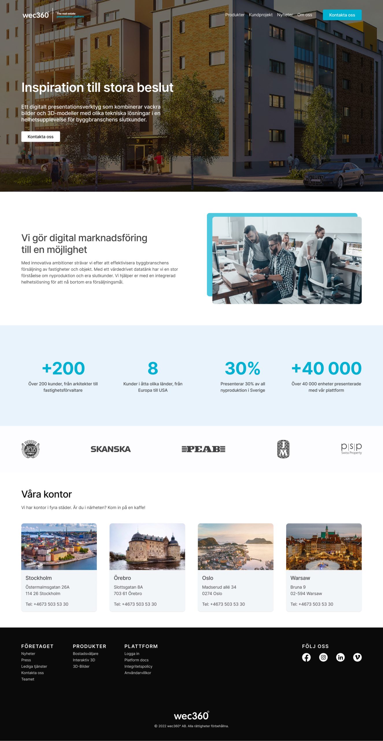
Through the redesign process, I aimed to address these issues heads-on, ensuring a more trustworthy and informative website. The design went through several iterations, involving thorough reviews and feedback sessions with the team, before reaching the final version of the website.
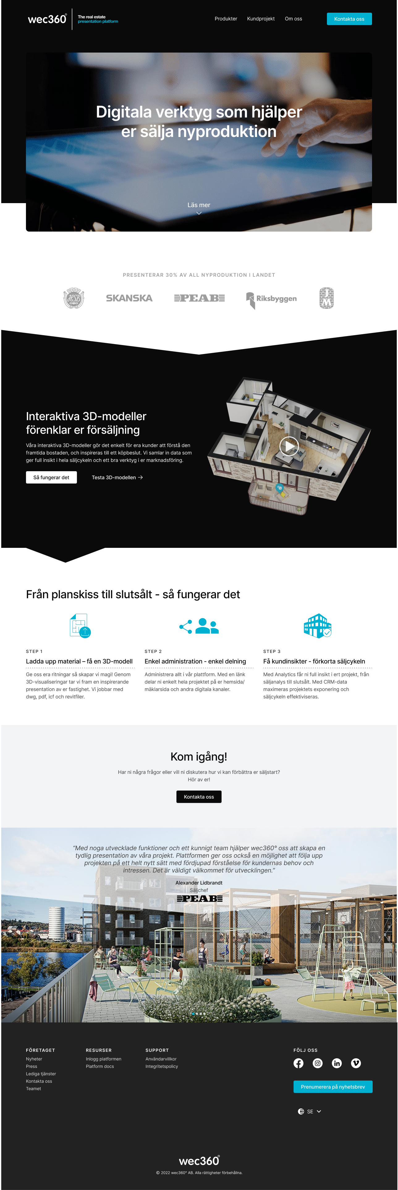
Final Design


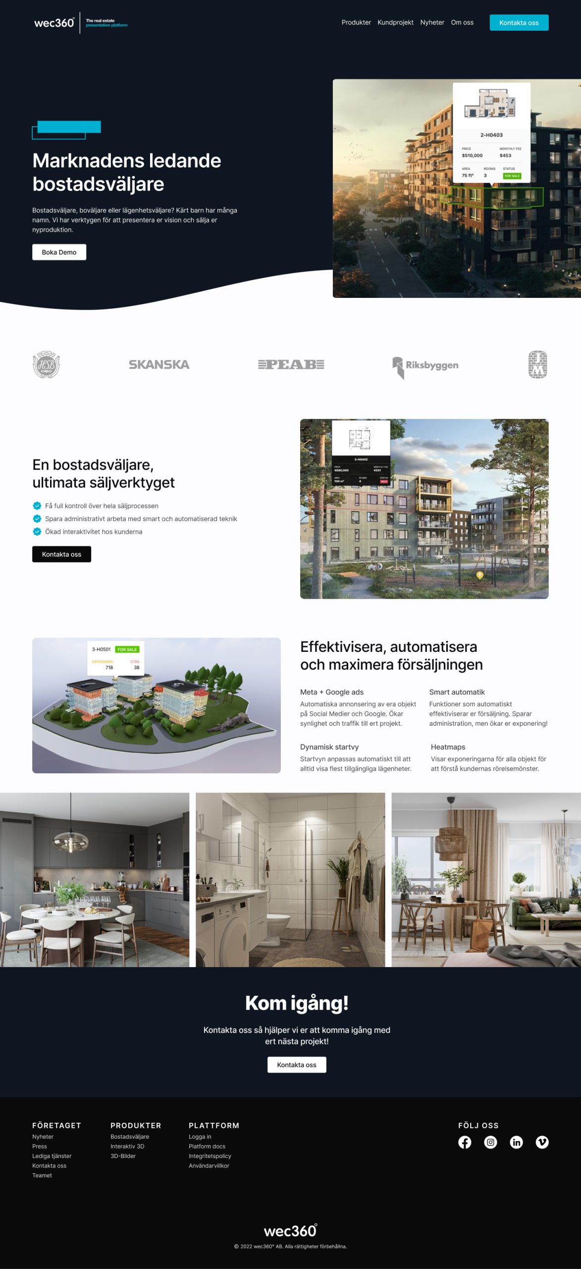
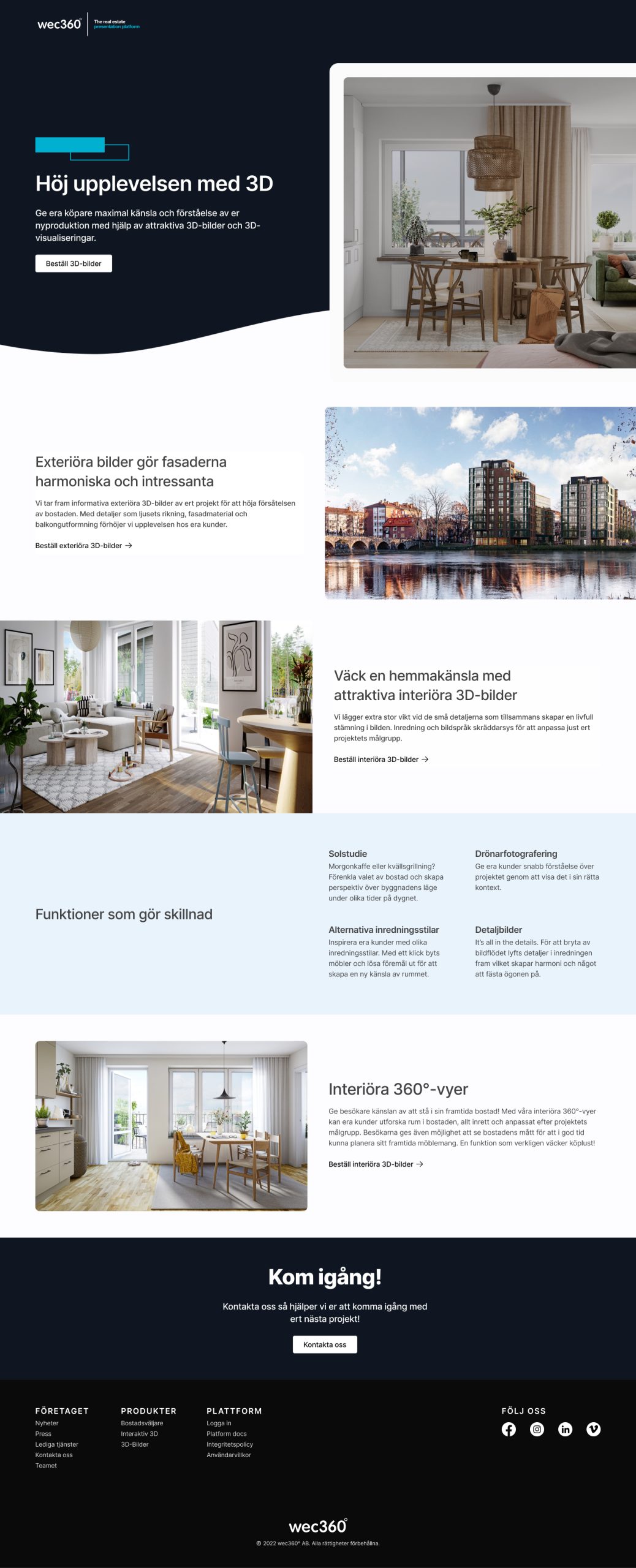
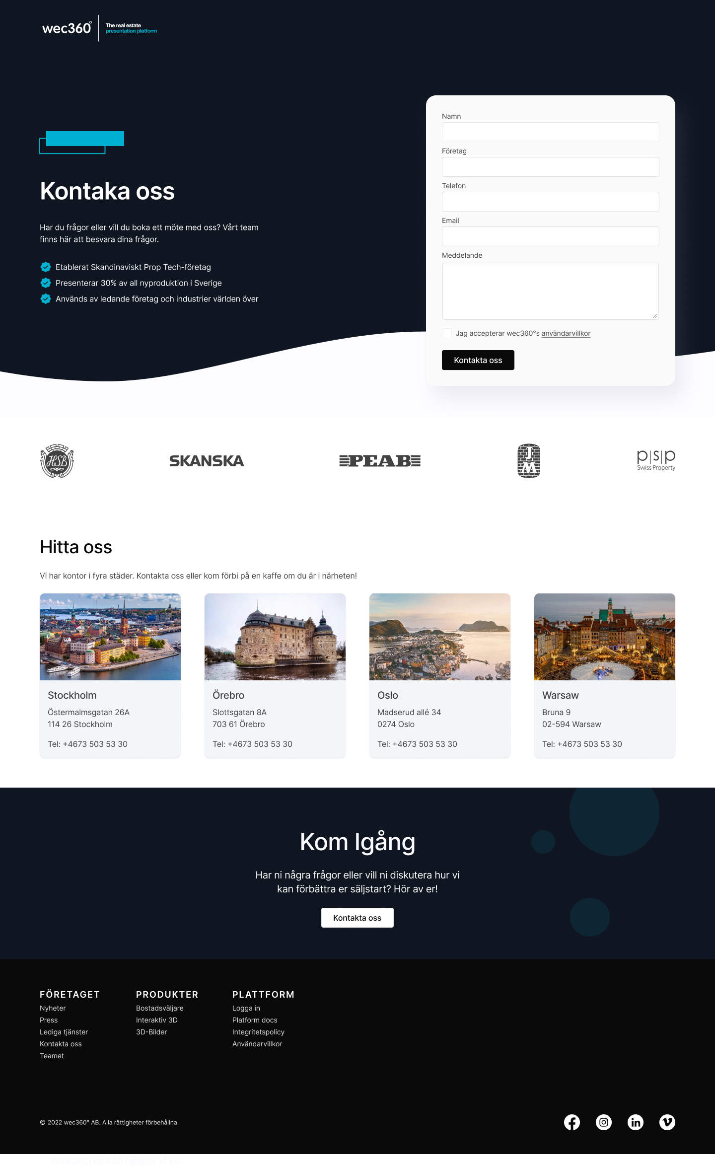
The Apartment Finder
Type
🖥️ Website
✏️ Research, UX/UI
Role
🎨 UX Designer
👥 Worked closely with the IT team
Timeline
⌛️ 3 months
Design Challenge
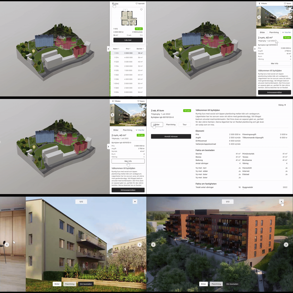
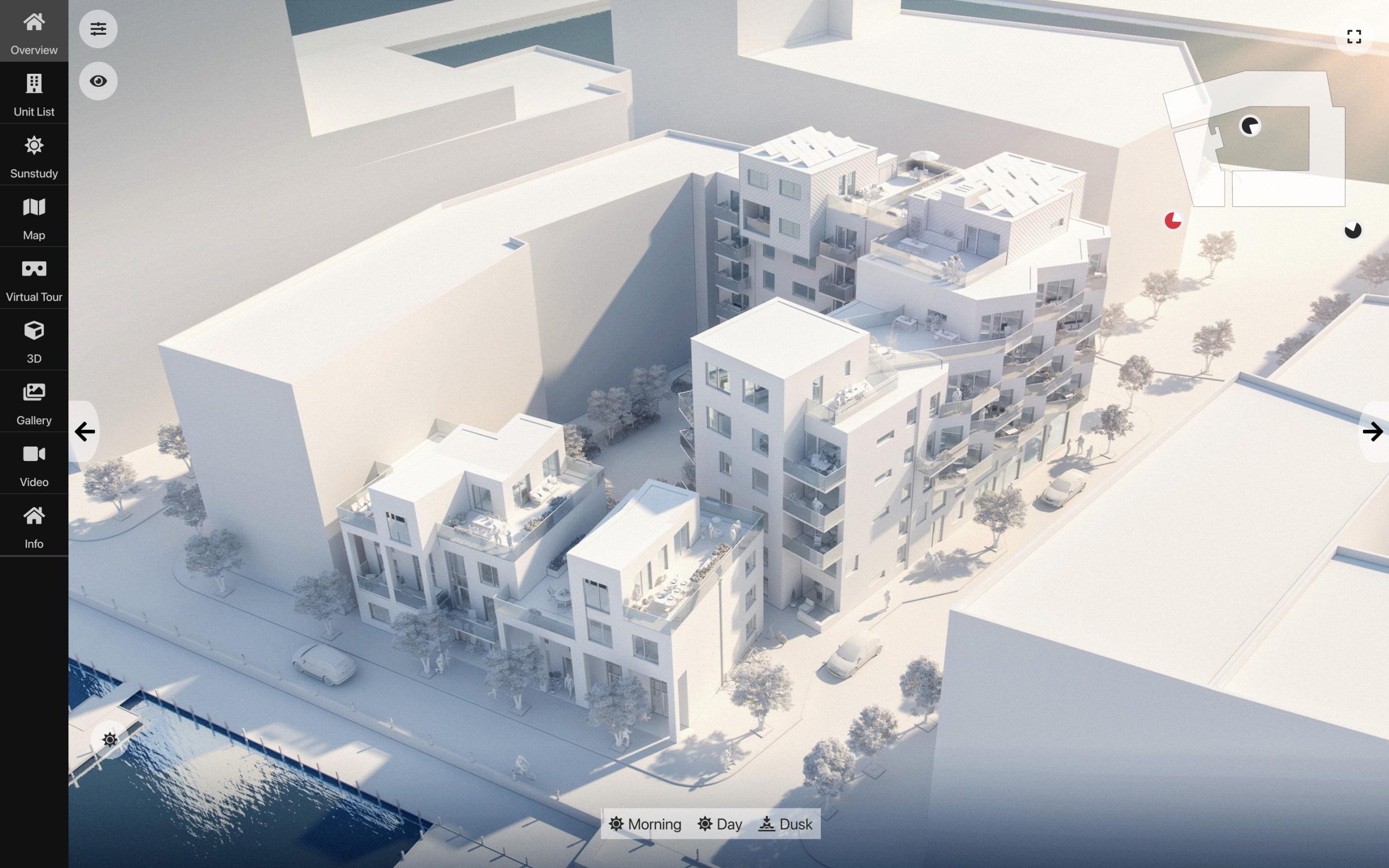
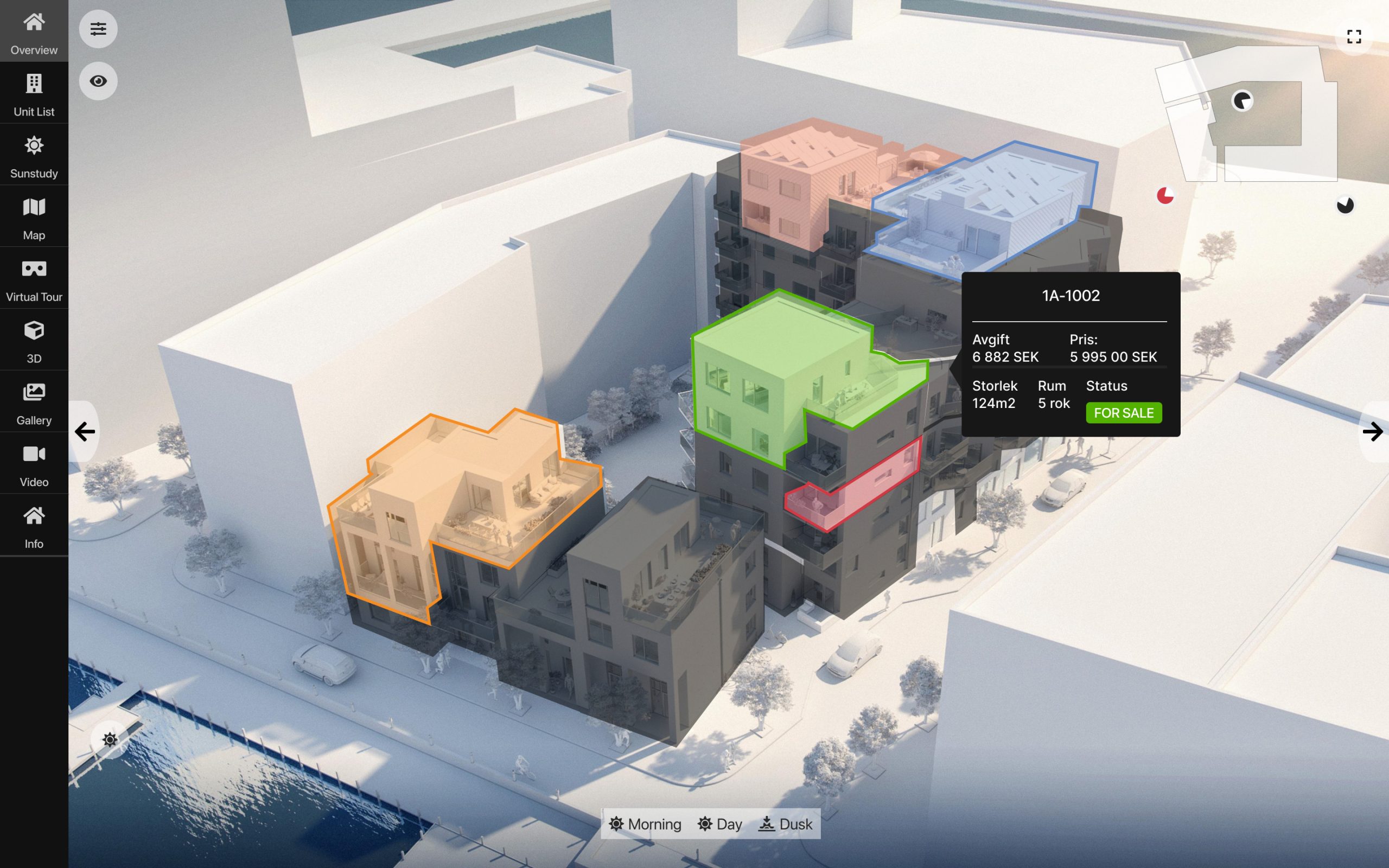
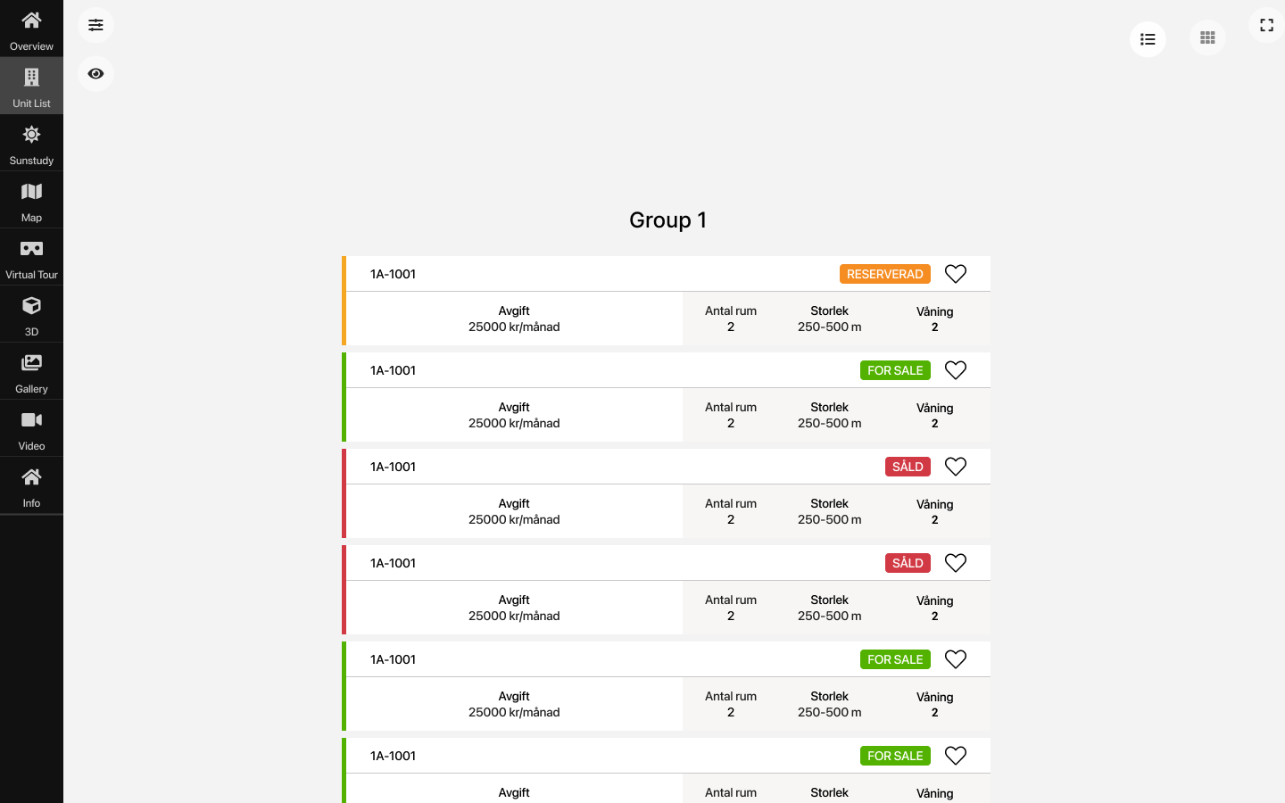
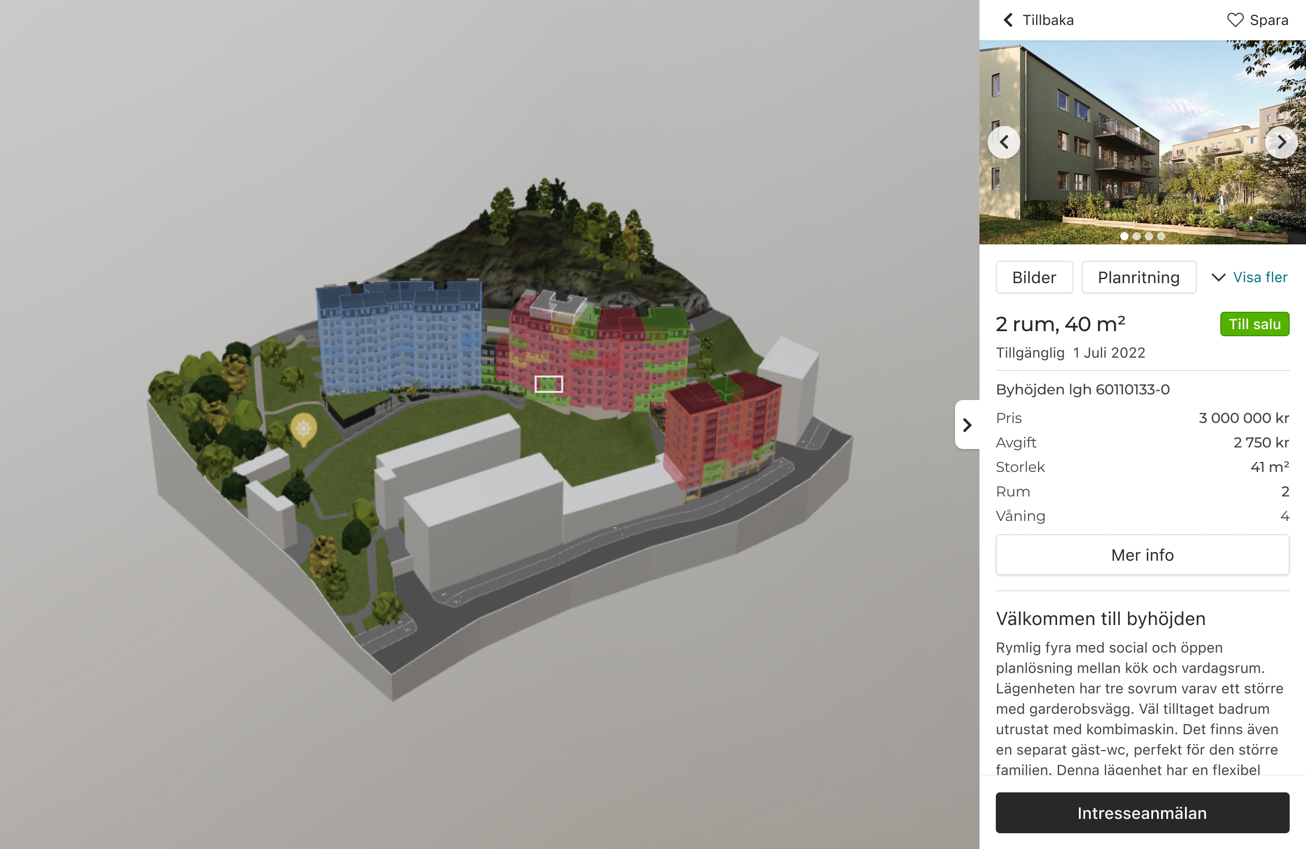
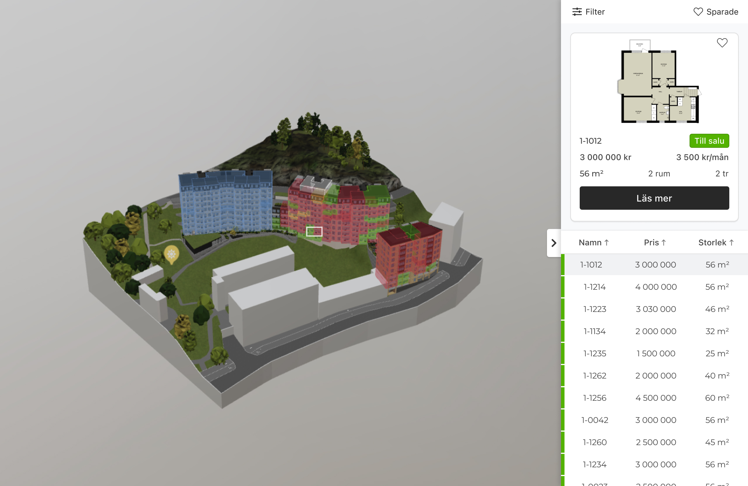
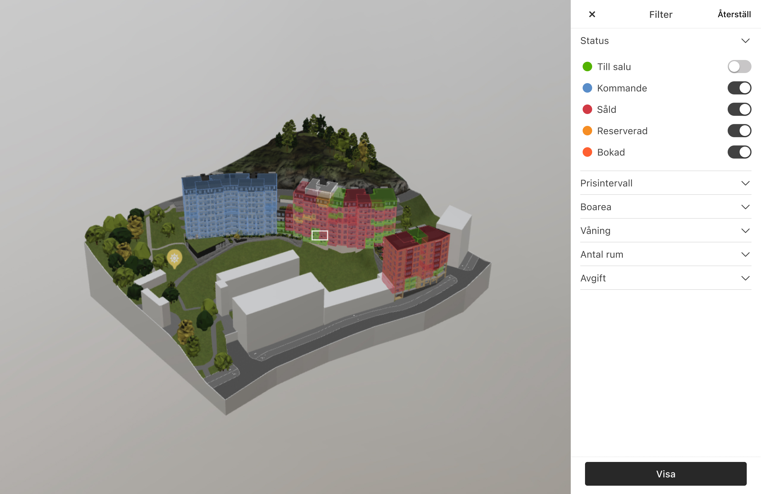
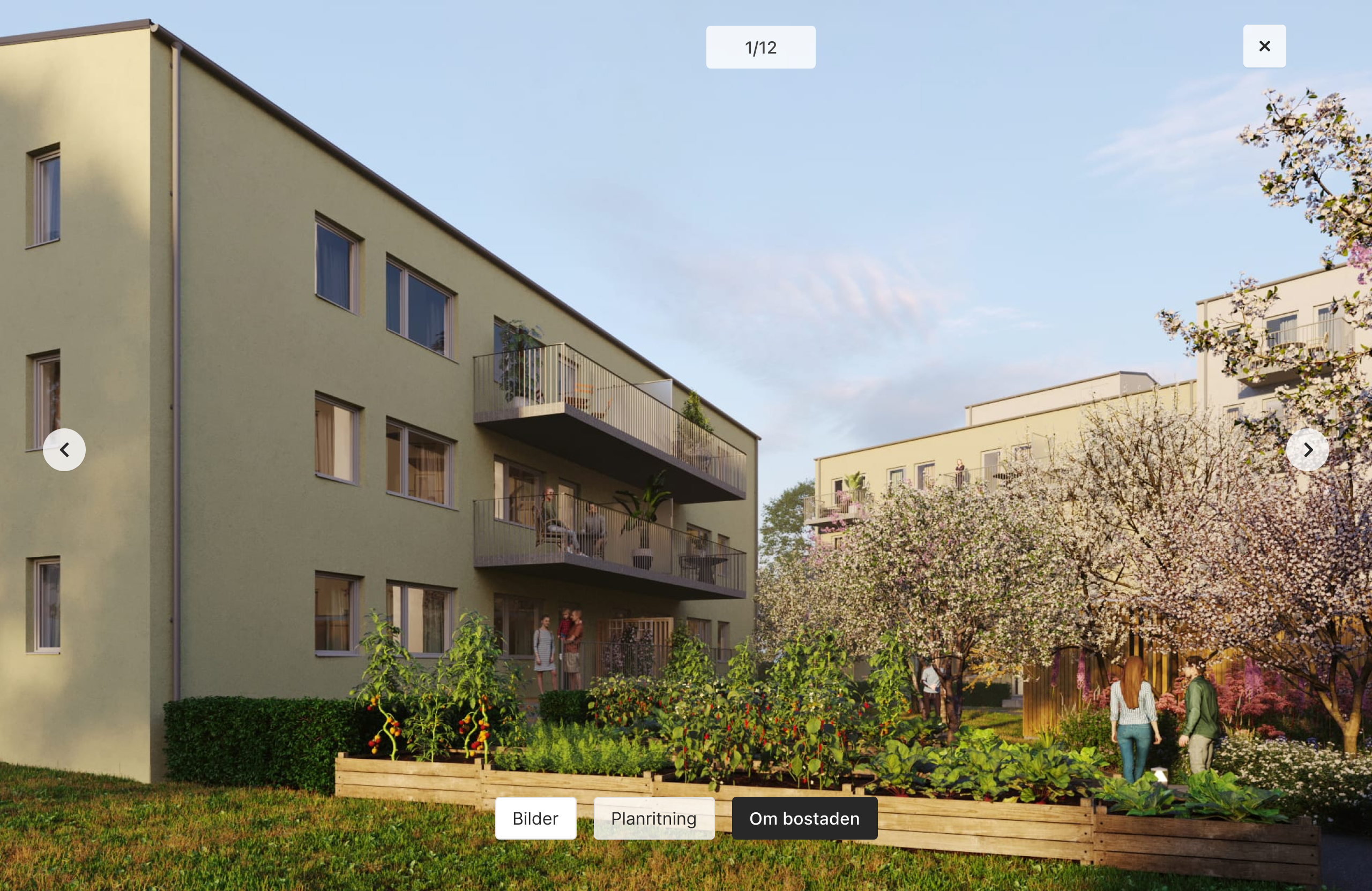
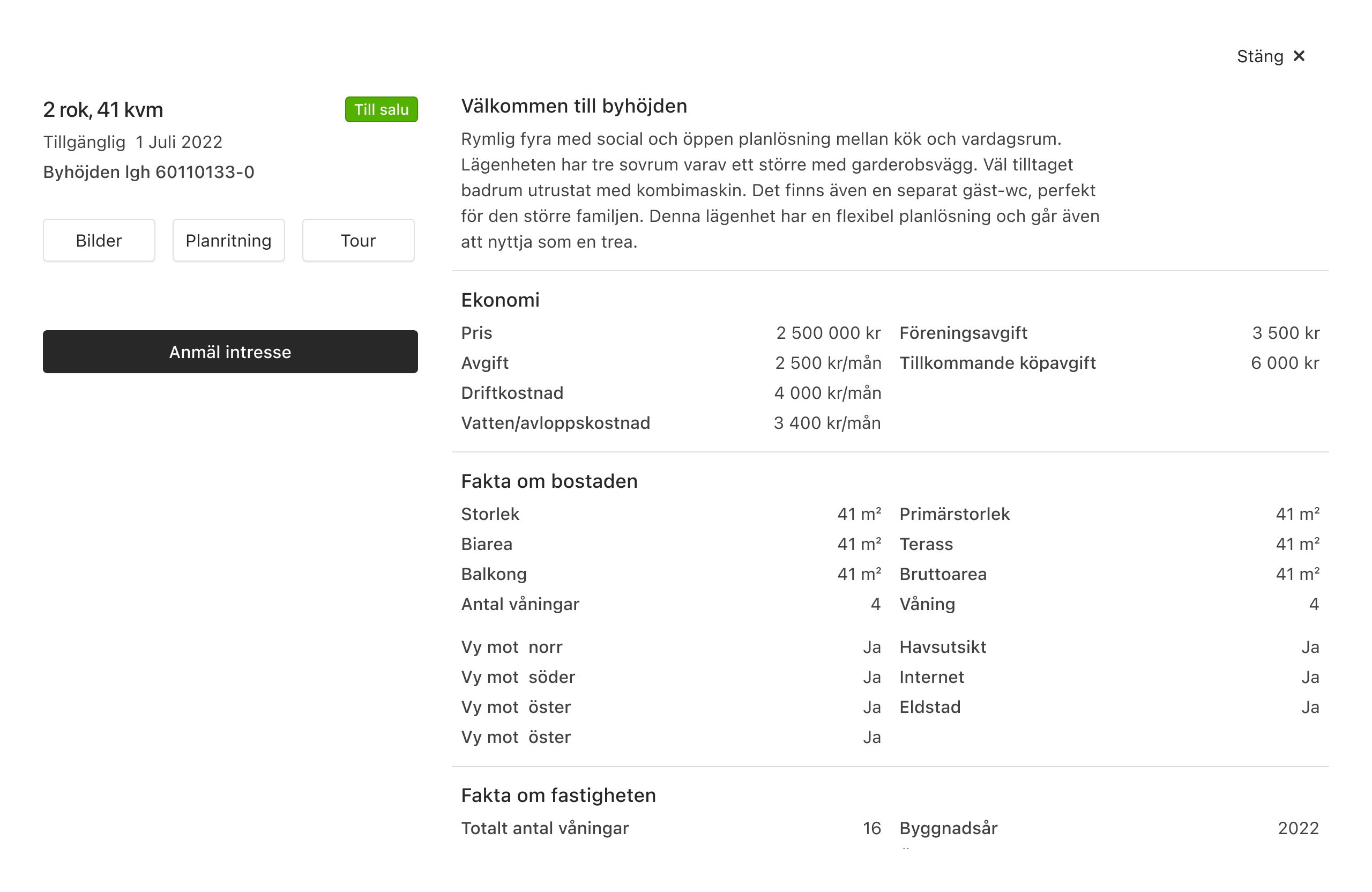
I was tasked to redesign one of wec360° core products, the apartment finder. Which is used by different target groups, from brokers and project managers to prospects searching for apartments. The apartment finder has various functionalities and views where the user can navigate between exterior and interior images, 3D models, floor plans, and 360° views. For this project, the team consisted of me as a UX Designer and two developers.
The Problem
As the user spends a lot of time in the apartment finder, therefore the menu needed a smoother user experience, facilitating seamless navigation between exterior and interior views
Design Process
I analyzed the current user journey of the product, identifying potential areas to integrate different views. With close collaboration with the IT team, I ensured that any limitations were taken into account and that the proposed ideas were feasible to implement. Once the flow was defined, I used drawings and sketches to illustrate the interaction, leading to the development of the final prototype in Figma.
Wireframes showing the previous menu navigation
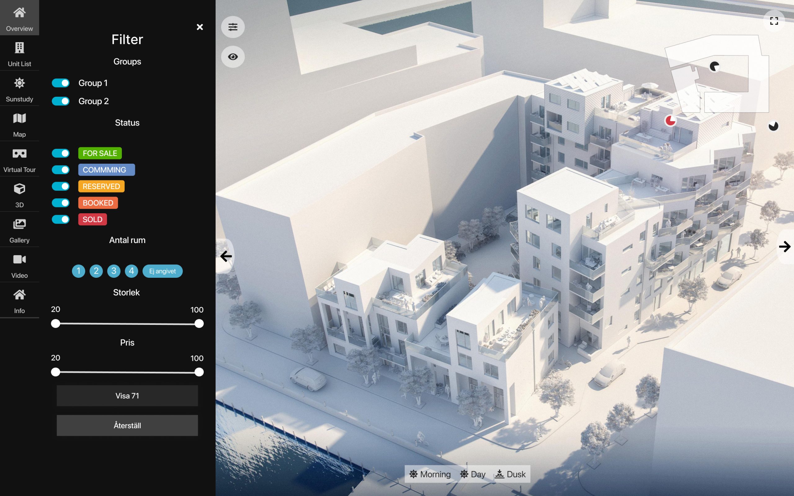
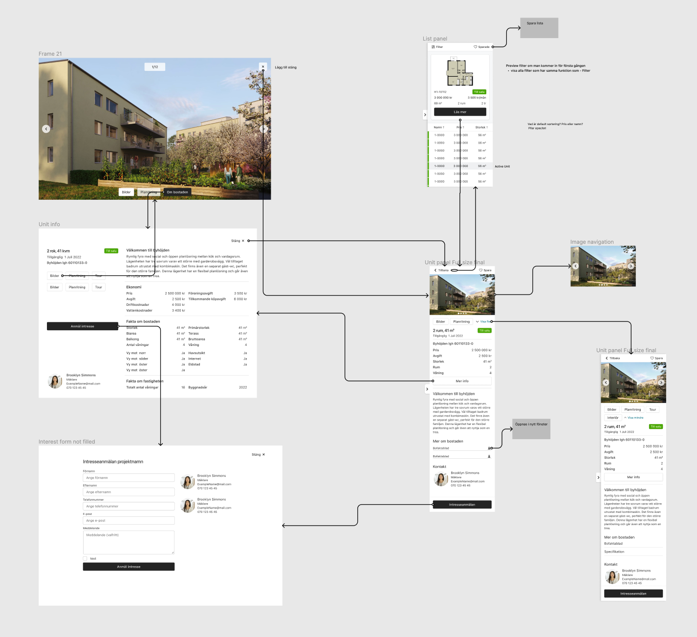
Final Design
Design system
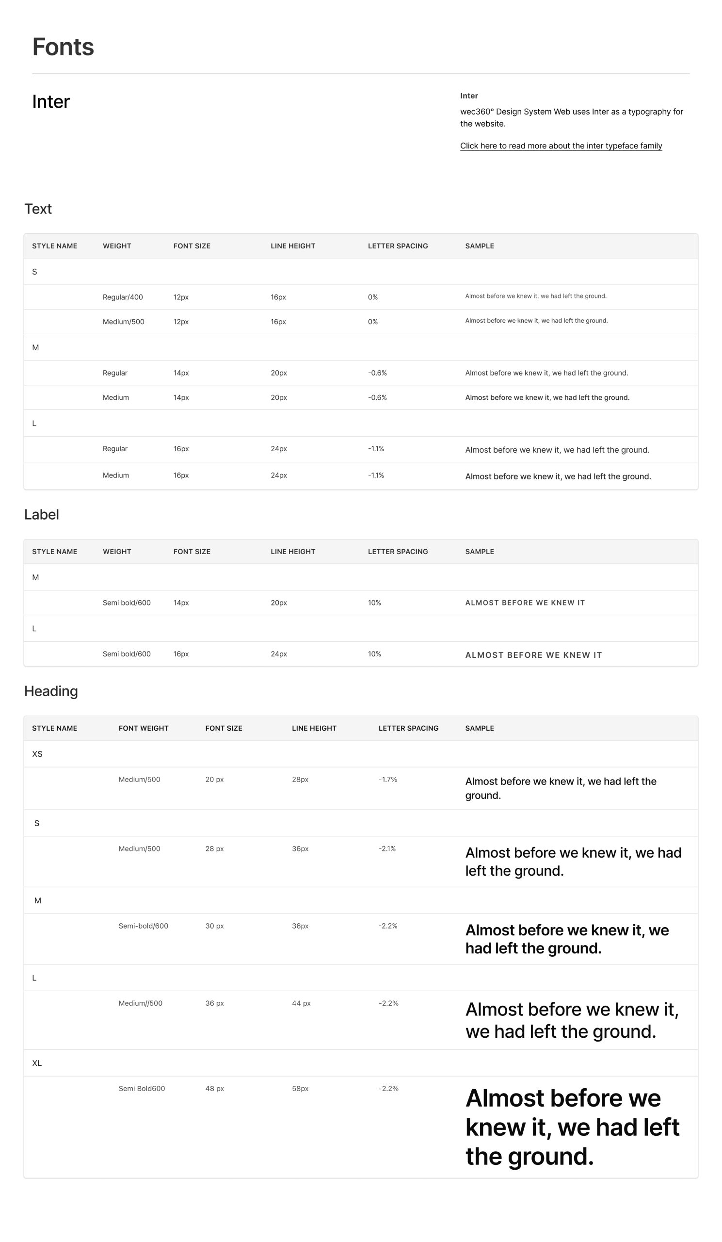
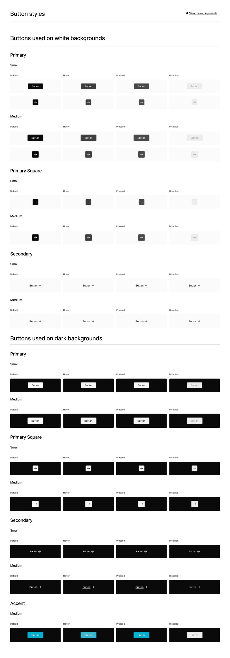
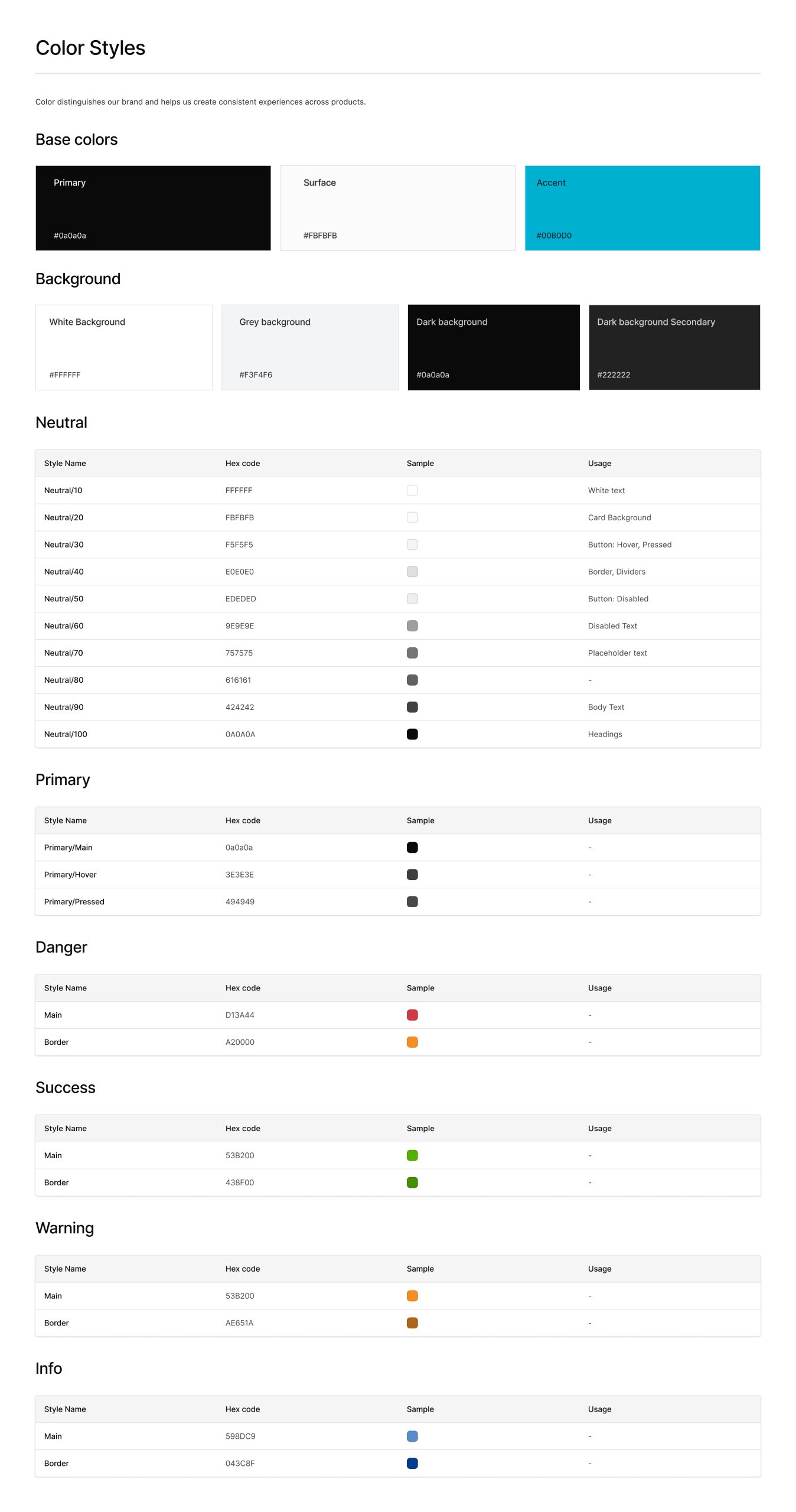
As the company was in an early stage I also took on the challenge of building a simple and user-friendly design system from scratch. I started by looking at the existing products and interfaces to understand what we already had and what was missing. I examined everything, from buttons to colors, to spot where things could be more consistent. Held discussions and meetings to make sure everyone understood why a design system would be beneficial. I developed a set of basic design elements that could be reused across different parts of the company's product. These included basic principles like consistent colors, easy-to-read fonts, and simple button styles that everyone could easily follow.
I continuously refined the design system and made small improvements to keep things simple and effective. Building a basic design system for a growing company was all about keeping things simple, clear, and easy to use. By focusing on the essentials, I created a foundation that not only simplified the design process but also improved the overall user experience.
